E-commerce
13 May 2026
What is the best ecommerce site? There is no single absolute winner for all shoppers and all categories. An excellent site for a DTC fashion brand may be a poor model for industrial B2B or for a generalist marketplace. The better question is rather: which site best serves its purchase intent, with clarity, trust, speed, and consistent after-sales service?
This guide avoids the buzz ranking without criteria. You will learn to spot what really makes a store work on the customer side, how to judge your own site without blindly comparing yourself to a giant, and where to invest first if you are optimizing a Shopify or another CMS. For the broader framework: succeed with an ecommerce site, how an online business works.
Reading objective: leave with a simple judgment grid (mobile, trust, content, funnel, measurement) and three questions to ask before redesigning or envying the competitor. We favor clear wording, not jargon.
Last point: the “best” sites change with design, regulation, and customer expectations. What remains stable is the need to reduce friction and be honest about prices, delivery times, and returns. Examples from major players often teach us about the public’s level of expectation, not about a recipe you can copy euro for euro.
If you run a small team, use this page as a quarterly review checklist: real mobile journey, reading of policies, customer support response time, consistency between ad and landing page. The best site for you will be the one that converts your qualified visitors without drowning you in technical complexity.
Rankings published in the press or on social networks often rely on not very transparent criteria: brand awareness, ad budget, or the subjective taste of a designer jury. They can inspire regarding visual finish, not your operating margin. Hence the interest in translating “best” into verifiable questions: is the funnel understood by someone who does not know your internal jargon? Are the displayed lead times met during busy periods? Are returns handled within the promised time frame?
For a brand just starting out, the “best” site is often an honest MVP: few pages but accurate about availability and service, rather than a broad catalog with uncertain stock. This assumed modesty builds trust better than an empty showy showcase. You will then enrich navigation, guides, and proof points as field feedback comes in.
The human channel matters as much as the page: a buyer who waits for a simple answer about delivery often attributes the disappointment to the whole site, not only to the support team. A consistency between marketing promise, funnel, and response time strengthens the feeling of excellence. To structure this part of the journey: improve the customer experience, automate support without sacrificing quality on sensitive cases.
Finally, a “better” site is a site that is maintained: security updates, up-to-date prices, internal links that do not lead to 404 errors, legal texts aligned with operational reality. The silent deterioration of a neglected site looks like a dusty physical store: visitors leave without always knowing why they are wary. Practical reference points: maintenance and risks, frequent failures in the first year. In essence, aiming for the “best” for your audience means choosing useful simplicity rather than decorative complexity.
Summary
No single champion: context and intention
When searching for « the best e-commerce site » on a search engine, people often mix up brand awareness, revenue, and quality of experience. A very visible player is not necessarily the right benchmark for your average order value or your need for storytelling.
Segment and intent
Strategic fallback, impulse purchase, lengthy technical research: each intent calls for a different journey. So evaluate a site in its context, not like an abstract work of art.
Your realistic benchmark
Compare yourself to brands of the same size and the same channel before aiming for the smoothness of a player that spends millions on R&D each quarter. For platform positioning: Is Shopify still relevant?, why choose Shopify.
B2B and long cycles
In some sectors, the "best" site is the one that makes quotes, technical documents, and sales follow-up easier, not the one that pushes card payment in one click. Adjust your criteria to the length of the cycle.
What the buyer really expects
A “good” site for the buyer quickly answers three questions: what do I get, when, and what happens if it doesn't suit me? Everything else supports those answers.
Clarity before originality
Graphic flair should not hide prices, fees, or deadlines. If the visitor hesitates because they do not understand, “beauty” counts for little.
Visible trust
Accessible legal notices, contact methods, reviews, or targeted proof: signals that matter more than a product carousel full of textless items.
To avoid: design mistakes that hurt conversions.
Selective social proof
Too many generic or off-topic reviews make reading tiring; it's better to have a few credible, contextualized elements. Also think about certifications useful to your vertical without overloading the header.
Structured feedback: feedback loop, returns strategy.
Mobility, speed and friction
On mobile, excellence is judged in seconds: readable text, tappable buttons, short forms, no pop-up that covers the main CTA at the wrong time.
Perceived performance
Slowness and bugs create distrust before the cart even comes into play. Even without a dedicated performance team, remove the unnecessary and test on a real device.
Mobile-first design
References: mobile-first strategies, improve web UX.
Perceived accessibility and inclusivity
Text contrast, font size, alternatives to purely decorative images: beyond compliance, it is a matter of readability for all usage contexts, including on the bus. A site that is difficult to read in sunlight loses sales silently.
Digital friction points
Menus that are too deep, filters that reset the selection, mandatory account steps too early: all reasons to abandon that you detect by observing real users, not just by looking at isolated heatmaps.
Navigation and brand: build the brand, omnichannel.
Checkout, payment, fee transparency
The best clear journeys handle delivery, returns, warranties, and payment methods without having to hunt for information. The buyer mentally compares your page to what they have seen from a dominant player: they expect a minimum of transparency.
Checkout and friction
Every field or unexpected fee is a candidate for abandonment. Work on the order of the steps and clear error messages.
Reading: checkout optimization, cart abandonment, Shopify checkout, payment gateways.
Funnel and reassurance
A few lines about payment security and shipping time near the pay button reduce last-second anxiety. Also test card error messages: human wording avoids the impression of a total outage.
Useful product pages and SEO
A useful product page combines honest visuals, dimensions or compatibility, benefits in customer language, and answers to common objections. It is not an empty marketing brochure.
SEO and usefulness
The best content serves the human reader first; search ranking follows when the page answers a clear intent.
Ideas: good product page practices, product page conversion, e-commerce SEO, improve site SEO.
Internal linking
The best sites naturally guide users toward useful guides or variants, without clickbait traps. It is both SEO and service.
internal linking, category pages, content and traffic.
Truth of stock and lead times
A site can be smooth and yet «bad» if the buyer discovers a stockout after payment or a doubled delivery time without a message. Inventory systems synchronized with the storefront avoid this silent betrayal of the cart.
When you enrich the catalog, align ops and marketing around a source of truth unique for availability and price. Discipline: Shopify product import, efficient inventory, order management. A site’s «beauty» does not make up for repeated stockouts on best-sellers.
Brand design without sacrificing clarity
The “best” site for your brand is often the one that serves the brand story without sacrificing the buying logic: predictable navigation, visible CTAs, visual hierarchy that guides.
Personalization with restraint
Recommendations and dynamic content help if you have traffic and clean data; otherwise, start with excellent, stable pages.
e-commerce personalization, e-commerce site design.
Visual and verbal consistency
The “best” journey keeps the same tone from the ad banner all the way to the confirmation email. A sudden mismatch (aggressive promotion followed by a cold form) breaks trust. Document a short voice for the site, social media, and customer support.
To connect experience and acquisition: SEO traffic, ads, social, Facebook ads post-iOS. Honest acquisition avoids the “best” traffic turning into bad return rates.
After purchase: promise kept
After the order, excellence continues: status emails, deadlines met, simple returns process. Public reviews quickly punish gaps between promise and reality.
End-to-end customer experience
customer experience, exceptional experience, automate support, returns.
Delivery and communication
An explanatory delay email is better than prolonged silence. Brands perceived as "best" are often those that use transactional messaging as an extension of the promise.
revenue email flows, fulfillment.
Loyalty and repeat purchase
The best site in the medium term is the one where the customer returns without friction: clear account, order history, restock option, simple program if your margin allows it. Over-engineering a VIP club before stabilizing basic shipping disappoints.
Benchmarks: retention, too-high churn, loyalty programs. Pair these topics with a successful first-order experience; otherwise you pay to buy back traffic instead of nurturing an existing base.
Marketplace, own brand, and CMS
Marketplaces offer liquidity and payment habits; brand sites offer control of the story and the data. « The best » depends on the role you play in the ecosystem.
CMS choices
For a store you own, compare realistic options: Shopify, WooCommerce, Magento, Shopify defined.
Hosting and technical foundations
A site admired for its appearance can collapse under a spike if hosting and caching do not keep up. Leaders invest heavily in this; an SME thinks instead in terms of modest overprovisioning and monitoring 5xx errors.
e-commerce hosting, SEO audits, SEO performance.
International and languages
An internationally « best » site displays language, currency, and local terms without surprises at checkout. Even if you translate only part of the catalog, clearly state the delivery areas.
Measure rather than make rough guesses
Instead of debating the « best site in the world », measure your funnel: qualified traffic, cart additions, successful payments, repeat purchases. Benchmarks give an order of magnitude, not a school grade.
Data and case studies
analytics: what to track, benchmarks 2026, conversion definitions, conversion case studies, GA tracking.
Order of experiments
Before adding four interactive experiments, check your baseline rates: home to listing, listing to product page, product page to cart. A modest gain on a broad step outweighs a gimmick seen by 2% of traffic.
Mistakes when imitating without the means
Copying the functional density of a giant without its resources often leads to a cluttered site. Better three clear journeys than half a dozen half-integrated gadgets.
Common pitfalls
Underestimating support workload, neglecting the mobile page, publishing a catalog that is too broad without reliable stock: classic causes of failure.
first-year failures, maintenance and risks.
Data-guided iteration
Teams that move quickly set a hypothesis, change one visible variable, measure for a week, decide. This rhythm avoids redesigns based on the loudest opinion in the meeting.
Organization: marketing plan, customer loyalty. Remember that a site that is «better» for the customer often is because the company behind it reads its numbers and publicly owns its mistakes in its policies.
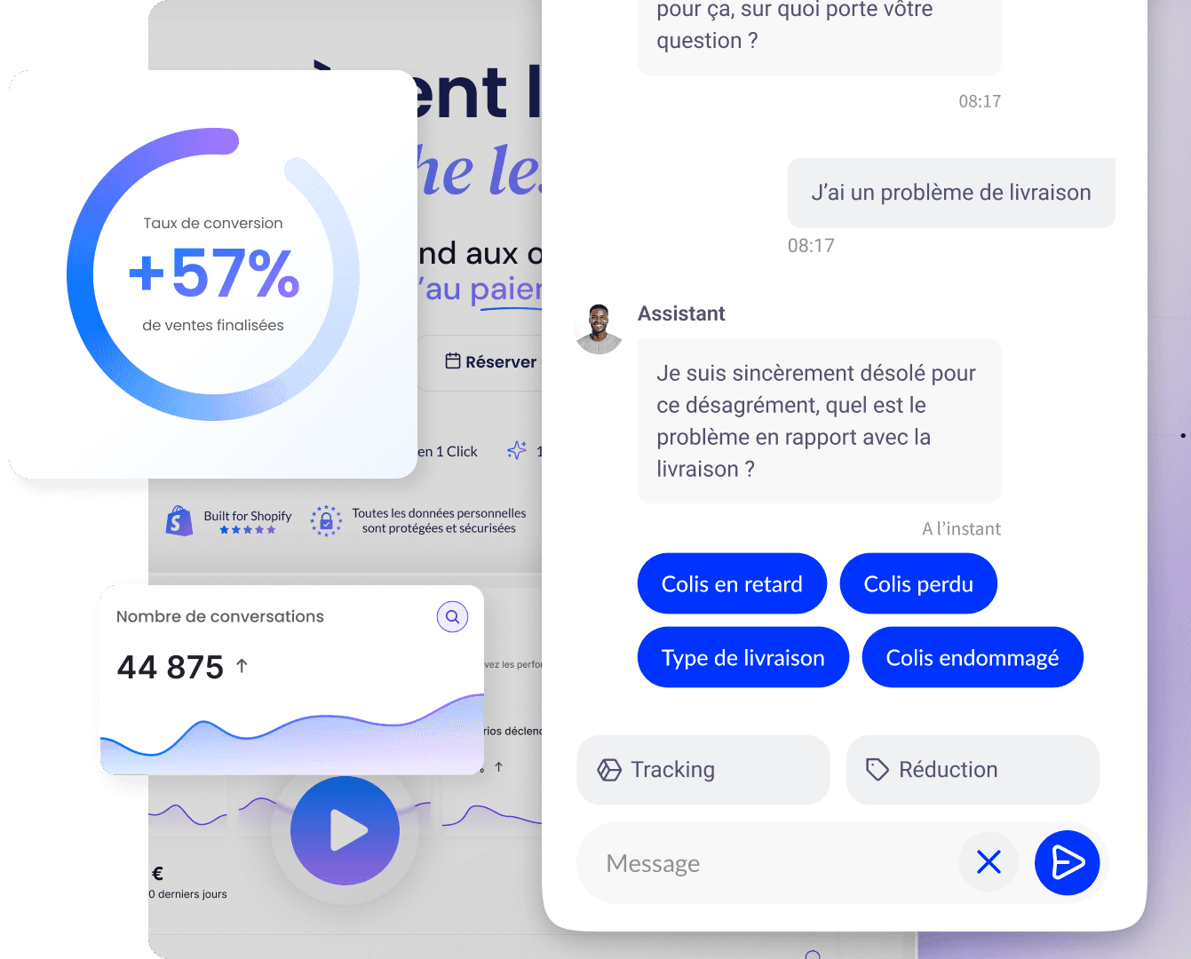
Qstomy: respond quickly without compromising the experience
Even excellent design does not replace a fast response to recurring questions about delivery or compatibility. Qstomy is an AI conversational assistant designed for stores, with deep Shopify integration, to help your visitors without multiplying FAQ silos.
Discover the demo, pricing, assisted selling, support, and analytics. For positioning: why an AI chatbot, chatbot: time and budget.
Conversations without overwhelming the team
An assistant must not invent logistical promises: it relies on validated answers and escalates sensitive cases. This discipline protects the reputation that a « super design » cannot repair after three poorly handled disputes.
Align chat and knowledge base: inbound service, success with automation. The goal is not to sound « high-tech » but to reduce the time until the useful answer.
Summary, FAQ, and Further Reading
In brief
There is no universally best site: it all depends on intent and segment.
Prioritize clarity, mobile, trust, and an honest funnel.
Measure your own funnel rather than a “buzz” list.
Copy principles, not the complexity of a giant without its resources.
FAQ
Can I say that such-and-such site is number one?
In an internal presentation, talk instead about relevant benchmarks for your category and your objectives.
Is the best site the prettiest?
Not primarily: readability and keeping the promise come first.
Should you copy Amazon to succeed?
No: keep the level of rigor on logistical clarity, not the whole model.
How should improvements be prioritized?
Start with mobile, price and delivery truthfulness, then product content and checkout.
Does SEO alone make a site “better”?
SEO brings them in; experience and service bring them back.
To go further
Does the best site change every year?
Expectations do, especially on mobile and transparency; the fundamentals of trust remain stable.
Do I need to redesign to be “up to par”?
Not necessarily: a series of targeted iterations on the funnel and product pages often beats a rushed complete redesign.
Can a minimal site be “the best” for me?
Yes if each page keeps its promises and customer support follows through: catalog depth matters less than the perceived reliability at the moment of first purchase.
How do you decide between two mockups?
Test them with real potential buyers on mobile; keep the one that reduces questions and hesitations, not necessarily the one the internal team likes best.
Do online reviews prove that a site is “better”?
They are useful but partial signals: they often reflect product and logistics as much as the interface. Cross-reference with your funnel metrics.

Enzo
13 May 2026