E-commerce
April 14, 2026
How can you increase e-commerce conversion rate? The useful answer is not “by adding a pop-up” or “by changing the color of a button.” In 2026, the most durable gains rarely come from a single micro-adjustment. They come from broader work on technical performance, trust, product pages, checkout, retention, and the quality of management. Recent best resources also remind us of this: conversion rate is not an isolated problem. It is the visible result of the quality of the entire system.
The topic is central because conversion rate connects almost everything that matters in a store: traffic quality, offer clarity, funnel friction, trust, support, reviews, reassurance, mobile, speed, message consistency, ability to re-engage properly and bring customers back. In other words, improving conversion is not just “making more sales.” It is often the most profitable way to do better with the traffic you already have.
In this guide, we will show how to increase an e-commerce conversion rate from concrete cases and truly observed levers: trust signals, reorganization of product pages, quick view, UGC, follow-ups, segmentation, speed, and data-driven management. The idea is not to give you a decorative list. The idea is to show you what really moves the business, why it works, and in what order you should look at things.
What you will understand : which conversion levers produced measurable gains in real cases.
What you will be able to do : prioritize your own tests without getting lost in surface-level optimizations.
To connect with : conversion rate optimization, conversion funnel and cart abandonment.
If your traffic already exists but sales are not following at the expected pace, this article will help you see where to act first.
Summary
A good conversion rate is never the result of a single “hack”
The first point to clarify is simple: an e-commerce conversion rate does not rise sustainably thanks to a single trick. Yotpo makes this very clear in its 2026 guide on the Shopify conversion: progress comes from a combination of factors, including technical performance, trust, user experience, the quality of product pages, and the ability to drive repeat purchases.
That is good news, because it means a poor conversion rate is not inevitable. But it also means you need to think in systems. A slow site, a vague product page, surprise fees at checkout, little social proof, and generic follow-ups do not compensate for one another. They add up.
The right framework
Instead of asking “what is the best CRO hack?”, ask these questions instead:
Is the traffic qualified?
Is the site technically smooth?
Is the product understood, desired, and reassuring?
Is the path to purchase simple?
Does the brand handle objections and retention well?
As long as these questions remain unclear, you may run a lot of tests, but gain very little.
What is a “good” e-commerce conversion rate in 2026?
This question needs to be answered with caution. Benchmarks can help, but they can mislead quickly. Yotpo notes that many reports place the average e-commerce conversion rate between 1 % and 3 %, depending on the category, price, brand maturity, traffic source, and device. Bazaarvoice also cites an average range around 2 % to 4 % depending on the sector. These figures are useful as a reference point, not as a verdict.
Why benchmarks are insufficient
Price changes everything: a low-cost accessory does not convert like a premium or technical product.
Traffic changes everything: email or brand traffic converts differently from cold paid traffic.
Mobile changes everything: it often brings more traffic, but converts less well.
Maturity changes everything: a well-known brand reassures faster than a young store.
The right reflex is therefore not to chase a global average. The right reflex is to track your own progress: month over month, source by source, page by page, and to look at related metrics such as add-to-cart, begin checkout, revenue per visitor, and repeat purchase rate when you have them.
Remember: a “good” conversion rate is first and foremost one that improves within a healthy business model. An increase without margin or customer quality is not enough.
Case study 1: trust signals can unlock conversion
The first concrete lever is trust. Searchbloom shows in its e-commerce case study that a partner generating a lot of traffic but converting below 1.5% improved its performance thanks to simple tests on reassurance signals. The addition of trust badges, recognized payment methods, and security signals produced a global increase of 12.6% in conversion rate.
Why it works
Because at the moment of payment, visitors want an implicit confirmation: “this site seems legitimate, the payment seems reliable, I can proceed without excessive perceived risk.” This need for security is even stronger for lesser-known brands, technical products, or higher-value carts.
What to take away
Badges are not magic, but they address a real objection.
Trust must be visible near decision points, not hidden in the footer.
Consistency matters: security, payment, returns, delivery, reviews, FAQ.
This kind of gain shows that part of the conversion rate depends less on traffic than on risk perception. A brand that does not reassure pays for this weakness in silent abandonment.
Case study 2: the right information in the right place changes the decision
Still in the Searchbloom study, a second test involved repositioning the product description near the “Add to Cart” button. This change led to a 26.8% increase in the desktop conversion rate. This result is particularly interesting because it shows that the issue was not simply “having a description,” but where it comes into play in the decision.
Why this test is so insightful
Many product pages already have useful information, but they place it too low, too late, or in a way that is too hard to read. The visitor then has to scroll, guess, or leave the page to check a point. At that moment, friction increases and the likelihood of purchase decreases.
What this means for your product pages
Benefits and key information should be close to the action.
Objections should not be pushed too far down.
Product content should be scannable: lists, proof, dimensions, use cases, material, return policy if it influences the decision.
This result complements very well what Yotpo and Bazaarvoice remind us: product pages are not simple showcases. They are commercial decision-making environments.
Case study 3: merchandising and quick access to products really matter
Searchbloom also tested adding a Quick View feature on collection pages. Result: +12.9% desktop conversion rate. This type of result may seem anecdotal, but it highlights a very concrete point: listing or collection pages are not just transition pages. They can already speed up or slow down the decision.
Why collection logic matters so much
When a catalog gets a bit large, friction is no longer only at checkout. It starts earlier: difficulty comparing, filtering, quickly seeing the essentials, understanding whether the product deserves a closer click. Better merchandising reduces this loss of cognitive energy.
Practical lessons
Work on your category / collection pages, not just your product pages.
Test quick access to information: quick view, filters, swatches, clear summary.
Don’t let the listing be a passive hallway.
This point is particularly useful for fashion, home decor, accessories, beauty stores, or any catalog with dense navigation.
Case Study 4: UGC and reviews change trust in purchasing
Bazaarvoice provides several very useful concrete signals. First, their platform observes that using a system of ratings & reviews can increase conversion by about 3.6% and engagement by nearly 12%. Next, they cite the case of Appliances Online, where the increase in review volume contributed to a conversion 3 times higher when shoppers interacted with the UGC. Finally, the case of Le Col shows a 5x increase in conversion and a 12% increase in AOV when visitors interacted with shoppable customer content galleries.
Why UGC is so powerful
Because it meets two needs at the same time:
The need for proof: people like me have bought and used this product.
The need for concrete use: how does the product perform in real life?
Bazaarvoice also notes that 40% of shoppers may refuse to buy if the product page does not display UGC. This figure clearly shows that social proof is no longer a bonus. For many visitors, it has become part of the product information itself.
What to prioritize
Reviews visible above the fold on the product page.
Customer photos and videos when the category lends itself to them.
Responses to questions and reviews to show an active brand.
Bazaarvoice even indicates that responding to feedback can improve conversion rate by up to 98% in some cases. Here again, this figure should not be read as an automatic promise. It should be read as a strong signal: conversation with the customer is part of the conversion.
Case study 5: reducing checkout friction remains a major lever
Yotpo and Bazaarvoice agree on this point: checkout remains the place where many sales are won or lost. Yotpo notes that shoppers are more likely to abandon when checkout adds unnecessary fields, unexpected costs, or slowness. Bazaarvoice cites Meta for Business: 87% of shoppers may abandon if checkout is too complicated. The exact number varies by source, but the message is clear: checkout friction kills conversion.
The most common problems
Shipping fees or taxes shown too late.
Mandatory account.
Too many fields on mobile.
Not enough fast payment methods.
Even without a named “major case study,” this lever is one of the most universal. Yotpo also emphasizes accelerated payments like Shop Pay, Apple Pay, or Google Pay as ways to reduce decision friction. The simpler and more transparent the checkout is, the fewer reasons the visitor has to delay the purchase.
The right testing logic
Start by checking surprise costs, the number of steps, mobile readability, and payment methods. Before looking for more complex tactics, make sure the funnel itself is not adding reasons to abandon.
Case study 6: segmentation and intelligent follow-up increase the value of existing traffic
Not all conversion lifts happen in the first session. A significant part lies in the ability to re-engage at the right time and with the right message. Shopify Segmentation shows that more refined work on segments can produce real results. Their page mentions a case where a well-identified segment, activated with personalized communication, converted at around 30 %.
Why segmentation improves conversion
Because it avoids treating all visitors or customers the same way. A checkout abandonment, an inactive customer, a big buyer, a new customer or a highly engaged customer do not need the same message. Generic follow-up leaves money on the table.
Three cases where segmentation helps immediately
Checkout abandonment: a quick and useful reminder.
High-value customers: more relevant offers or recommendations.
Dormant customers: targeted re-engagement instead of blind promotion.
This logic matters for a simple reason: poorly re-engaged existing traffic is expensive. Good segmentation does not just create more emails. It improves the conversion of the entire system.
The 6 levers to prioritize in the right order
From the previous cases, we can establish a useful hierarchy. Not all optimizations have the same priority. Here is a workflow order that is often more profitable:
Technical and mobile performance: a slow site ruins everything else.
Trust and social proof: reviews, badges, UGC, responses.
Clarity of product pages: benefits, objections, information near the action.
Merchandising and navigation: collections, filters, quick view, search.
Checkout: fees, payments, simplicity, mobile.
Segmentation and retention: follow-ups, abandonment, high-value customers.
This sequence avoids the common mistake of testing cosmetic details while the biggest leaks are still structural. A brand that has neither social proof, nor product clarity, nor a properly optimized mobile experience has no reason to start with overly fine optimizations of CTA wording.
Example: if your conversion is low, but your pages do a poor job of highlighting reviews and product benefits, a button color test is probably not the best next action.
How to turn these cases into an action plan for your store
The proper use of a case study is not to copy a site or a widget. It is to identify the logic behind the result, then test it in your own context.
Simple 5-step method
Choose a leak point: product page, collection, cart, checkout, mobile, follow-ups.
Formulate a clear hypothesis: “Lack of trust is slowing purchases”, “the description is too far from the CTA”, etc.
Define a primary metric: conversion, add-to-cart, RPV, begin checkout.
Test one clear change: not three variables at once.
Re-read the result in context: traffic source, device, product type, season.
Shopify Analytics reminds us that sales, sessions, conversion, and campaigns can be tracked clearly enough to avoid flying blind. A store that tests without a good analytics read does not know whether it is actually improving its model or simply benefiting from temporary noise.
That is also why conversion work must stay tied to profitability: a conversion lift won through massive discounts does not have the same quality as a lift born from a better journey, stronger social proof, or better CRM.
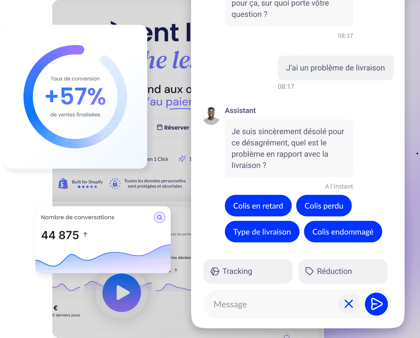
Qstomy: a useful lever when conversion stalls over unresolved questions
In many stores, part of the conversion is lost even before the cart for one simple reason: the customer doesn’t have the answer at the right time. They hesitate about the product, compatibility, delivery time, returns, size, material, or the difference between two variants. This friction does not always appear in reports. Yet, it weighs on sales.
Qstomy can intervene here as an AI sales and support agent. The goal is not to replace CRO fundamentals. The goal is to remove objections faster that prevent the visitor from moving forward, while giving the team a better view of the questions that come up most often.
For conversion : see the Sales page.
For Shopify : see the Shopify integration.
To understand the analytics issue : what is e-commerce analytics.
For a demo : request a demonstration.
In a CRO plan, this type of tool becomes useful if your traffic already exists, your objections are recurring, and your team does not have the capacity to respond quickly or well enough to each visitor.
In short, sources and FAQ
In brief
Improving an e-commerce conversion rate doesn't rely on a single trick. The most convincing cases instead show a repeated logic: build trust, bring product information closer to the decision, merchandise collections better, reduce checkout friction, leverage UGC, and segment follow-up better. Conversion improves when the journey becomes clearer, more reassuring, and smoother.
Trust signals can unlock a hesitant purchase.
The right information near the CTA changes the decision.
UGC and reviews massively strengthen trust.
Checkout should remove obstacles, not add them.
Segmentation helps better convert already acquired traffic.
Sources (external)
Yotpo: How To Increase Shopify Conversion Rate: 2026 Tactics.
Searchbloom: E-Commerce CRO Case Study: 26% Increase in Conversion Rate.
Bazaarvoice: 10 ways to improve e-commerce conversion rates.
Shopify: Analytics and reporting.
Shopify: Segmentation.
FAQ
How can you quickly increase the e-commerce conversion rate?
The quickest gains often come from trust, product pages, checkout and mobile. These are the areas where visible friction directly slows decision-making.
Which case studies show a real impact on conversion?
Searchbloom shows increases of 12.6%, 26.8% and 12.9% depending on the tests conducted on trust badges, product descriptions and quick view. Bazaarvoice also cites cases such as Appliances Online or Le Col with very clear gains linked to UGC.
Do customer reviews really improve conversion?
Yes. Reviews, customer photos and videos strengthen trust and answer real usage questions. They often play a decisive role in categories where product perception matters a lot.
Should you start with checkout or product pages?
It depends on your main leak, but product pages and social proof are often priorities if traffic isn't yet reaching checkout. If the cart is fine but the final purchase drops off, then checkout becomes the priority.
How do you know which lever to test first?
First choose the weakest area of your funnel: collection, product page, cart, checkout, follow-up. Then test a clear hypothesis with a single primary metric.
Go further

Enzo
April 14, 2026