E-commerce
April 8, 2026
The design of an e-commerce site is not limited to a style guide or a “pretty” theme: it covers the way visitors find, understand, and buy from your online store. It combines user experience (UX), interface (UI), information architecture, performance, accessibility, and brand consistency, with a business goal: clarity, trust, and conversion.
This Convert & Sell-level guide defines the scope, the main pillars, and common pitfalls. To extend the design on the structure and acquisition side, see e-commerce SEO, the conversion funnel, and the e-commerce product catalog (lists, product pages, organization).
Useful references: for performance and page experience, the web.dev : Core Web Vitals documentation (Google); for the store ecosystem, Shopify themes show how structure and customization combine. Thresholds and tools evolve: check up-to-date sources during your audits.
We do not promise a “universal template”: the right design depends on your target audience, your catalog, your margin, and your acquisition channels. However, principles (readability, predictability, user feedback, measurement) apply to almost all stores.
At Qstomy, the conversational design of the AI chatbot (widget, tone, content) must align with your site; Shopify integration and the site’s support or sales pages extend this logic.
During a workshop, start with three questions: what should be understood in 5 seconds on the homepage? where does the journey break most often (listing, product page, cart)? what trust signals are missing on mobile? Without these benchmarks, redesigns polish more than they increase revenue.
Design must also anticipate catalog growth: navigation that works with 200 products can break with 20,000 SKUs and poorly indexed facets. Think “scalable template” from the mockup stage, not just the homepage hero.
Internal stakeholders (legal, finance) often have constraints that are invisible in mockups: required notices, free-shipping thresholds, geographic restrictions. Integrating them early avoids ugly visual patches in production.
Finally, design must account for network error states: unsynced cart, interrupted payment, expired session. Calm messages and recovery actions (“resume cart,” “resend the link”) preserve trust better than a raw error code.
For product teams, design also serves as a prioritization framework: every new homepage banner cannot be “just as important” as the previous one without visual hierarchy. A clear editorial grid prevents promotional stacking that buries the evergreen offer.
Design, marketing, and ops teams must share the same map of critical journeys: otherwise merchandising pushes promos that checkout cannot support, or vice versa. A joint workshop on the “top 10” customer irritants is often enough to align the roadmap.
B2B adds constraints: multiple accounts, quotes, approved lists. Design must provide distinct journeys or portals without artificially duplicating the entire B2C site.
Summary
E-commerce design: beyond “beautiful”
Design directs attention, reduces cognitive load and makes actions obvious: add to cart, choose a variant, understand fees, get help. A site that looks good but is confusing about prices or delivery times converts less than a simple, readable site.
UX and UI
UX covers journeys, content, errors, help; UI covers visual components, contrasts, spacing, button states. The two are inseparable on mobile, where space is limited.
Measurable goals
Design is evaluated with metrics: conversion rate, scroll depth on the product page, form errors, time to purchase, product returns related to the description. Without measurement, personal taste is confused with performance.
Consistency with the marketing promise
If your acquisition promises « 24-hour delivery » or « easy returns », the design must reflect these messages on key pages (cart, footer, product page). A disconnect between ad and site fuels cart abandonment: the design must remain consistent with the promise.
Design system and UX debt
Without a shared component library, each campaign adds a different style: buttons, alert colors, spacing. The UX debt accumulates until a costly redesign becomes necessary. Investing early in a small design system pays off, especially if several squads work on the front end.
Information architecture and navigation
Visitors must guess where to look for a category, a return policy, a size guide. A deep site structure without shortcuts, or jargon-heavy labels, increase abandonment.
Menus and facets
Limited main menus, clear filters and sorting on product lists, breadcrumbs on product pages: all useful cues for SEO and for the user (internal linking detailed in the SEO guide cited in the introduction).
Internal search
A search tolerant of mistakes, with suggestions and synonyms, reduces frustration when the catalog is large.
Empty states
Lists with no results, empty carts, accounts with no orders: provide helpful messages and alternatives (nearby products, help) rather than a blank screen.
Footer
The footer groups help, legal, social networks: structure it for quick scanning; it is often the last resort before leaving the site.
SEO and navigation
URLs and menu anchors influence internal linking: avoid purely creative labels without a useful keyword when search intent is obvious for your category.
List pages and product pages
The listing compares quickly; the product page convinces in detail. Sharp photos, zoom, short video, dimensions, compatibility, care: everything that reduces uncertainty before purchase.
Price and availability
Clearly displaying prices incl. tax, promotions, lead times and stock avoids abandoned carts and repetitive support: a clear product page reduces incoming tickets about the same topic.
Social proof
Authentic reviews, ratings, moderated UGC: the design should integrate these elements without overcrowding the product page on mobile.
Variants and stock
Colors, sizes, options: clearly disable impossible combinations and explain why (out of stock) rather than a generic error on click.
Editorial content on the product page
Usage guides, short comparisons, links to articles: useful for SEO and conversion if the design avoids a wall of text with no headings.
Cross-sell and bundles
Blocks like « frequently bought together » or accessories: useful if the design limits distraction on mobile (carousels that are too long are tiring). Each recommendation must make business sense, not just be algorithmic.
Labels and badges
New, bestseller, eco-designed: too many badges defeat the purpose. Prioritize one or two strong pieces of information per product page to avoid visual noise.
Purchase funnel, cart and checkout
The design of the cart and checkout minimizes unnecessary steps, highlights the total early, and avoids unpleasant surprises about fees or delivery times. For the detailed levers: increase conversion at checkout (the funnel is mentioned in the introduction).
Guest account
Allowing purchases without creating an account, then offering sign-up after checkout, is a common practice to reduce friction.
Input errors
Clear messages (postal code, phone number) and inline validation help avoid drop-offs caused by technical frustration.
Visible summary
Reminding users of the cart, fees, and delivery times before payment limits backtracking to “check”: a principle similar to the CRO best practices mentioned below.
Payment methods
Displaying the logos expected by your target audience is reassuring; the design must handle 3-D Secure failure states without making it look like a bug.
Delivery and click and collect
If you offer in-store pickup or parcel locker pickup, the design must make the choice explicit before payment, with delivery times by option: this avoids post-purchase cancellations for the “wrong option.”
Loyalty program
Points, tiers, member benefits: integrate them into the header or account area without overcrowding the main navigation; the value should be readable in two seconds for a logged-in customer.
Mobile-first and responsive
A majority of e-commerce traffic goes through the mobile on many stores: the design should be designed first for small screens, then adapted to desktop, not the other way around.
Touch targets
Buttons large enough, spacing between links, no hover states required to discover critical information.
Short forms
Appropriate keyboards (email, numeric), address autocomplete when possible, visible progress across multiple steps.
Sticky CTA
On the product page, a fixed add-to-cart button at the bottom of the screen can help when the page is long; test to avoid hiding critical information.
Landscape mode and tablets
Hybrid tablet use cases deserve intermediate grids: neither stretched desktop nor giant mobile.
Mobile accessibility
Image zoom, screen readers on product lists: test with native iOS and Android tools, not just the desktop simulator.
PWA and installation
If you offer an installable web app, the icon and splash screen extend your brand: keep the same identity as the site so as not to disorient users.
Perceived Performance and Loading Techniques
Speed is part of design: perceived waiting, loading skeletons, prioritizing images above the fold. The Core Web Vitals (LCP, INP, CLS) provide technical benchmarks; see web.dev.
Images
Modern formats, appropriate sizes, careful lazy loading on critical content: design should not sacrifice product quality for lightness, but optimize the pipeline.
Third-party scripts
Pixels, widgets, embedded reviews: every addition can degrade performance; audit the stack.
Perception of loading
Skeletons and placeholders consistent with the final layout avoid jarring visual shifts (good for the experience and for CLS).
Seasonal peaks
Black Friday and sales: ship fewer experimental features during critical periods; prioritize stability and monitoring.
Hosting and CDN
Performance also depends on the infrastructure: hosting choice, caching, CDN for media. Design cannot compensate for an overloaded server during peak periods.
Accessibility, trust, and compliance
Sufficient contrast, useful alternative text, keyboard navigation, heading structure: the accessibility broadens your audience and reduces information disputes. It often goes hand in hand with better clarity for everyone.
Trust
Legal notices, terms and conditions, return policy, visible payment methods: the design must make them easy to find without digging.
Cookies and consent
Non-intrusive but compliant banners: avoid overlays that block access to content without informed consent.
Readability
Minimum font size, reasonable line length, sufficient line spacing: reading comfort increases time on page and understanding of guarantees.
GDPR and preferences
Clear marketing preference centers: design helps informed consent without drowning the user in ten identical switches. Each switch should have a label that is understandable without opaque legalese.
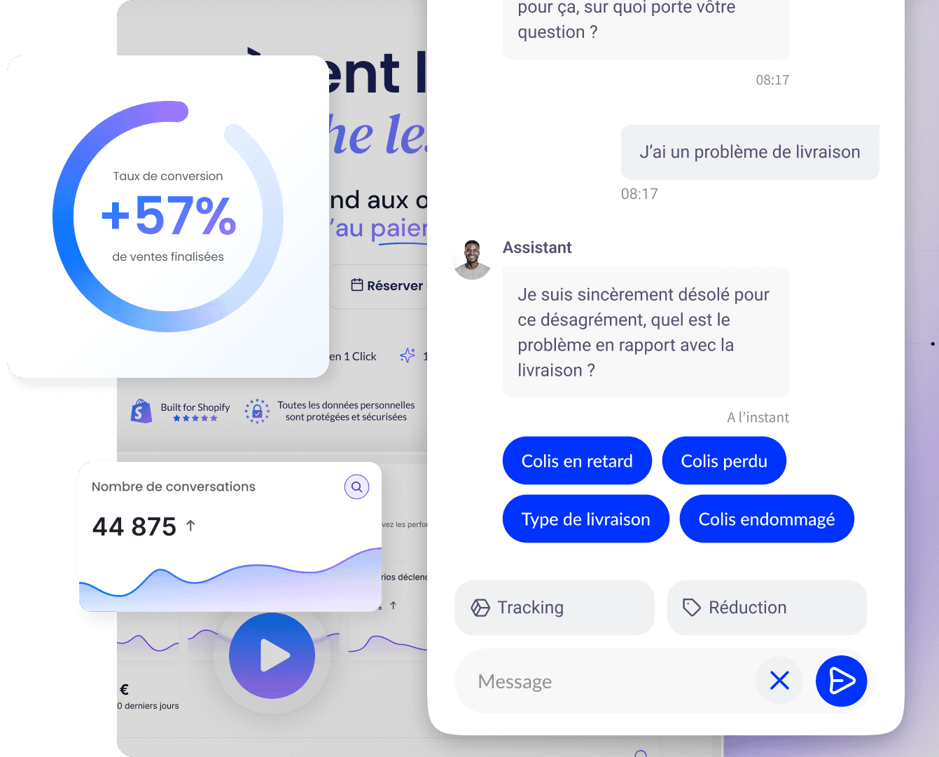
Chat and help
Help widget placement: avoid it covering the add-to-cart button on mobile. Provide a « safe » zone for critical CTAs.
Visible legal
Terms and conditions and privacy policy links accessible from every step of the funnel: this is not decoration, it is a regulatory expectation and a trust factor.
Brand identity, tone, and omnichannel consistency
Typography, colors, illustrations, and tone of voice must be consistent with your email campaigns, social media, and packaging. A visual disconnect between the ad and the landing page creates distrust.
Design system
Component library (buttons, product cards, alerts): accelerates iterations and avoids inconsistencies page by page.
International
Translations, currencies, date formats, and reading direction: plan for them in the template so you don't have to patch things up afterward.
Photography and diversity
Lifestyle visuals must reflect your target audience without clichés; consistency with the product avoids expectation gaps upon receipt.
Dark mode
If you offer a dark theme, check product contrast and price readability; it's not just a "trend" option but a complete review of semantic colors.
SEO, content and design: working together
The design influences internal linking, headings, visible URLs, and speed: these are not two silos. Editorial content (guides, FAQ) must be integrated into readable templates, not added at the bottom of an unreadable page.
Structured data
Product markup, reviews, organization: design must leave technical room for the right fields without visually duplicating the information.
Blog and guides
Articles must share the same typographic grid as the catalog so as not to give the impression of an “other site” attached to the store.
Indexable transactional pages
Whether or not to filter faceted duplicate listing pages: an SEO decision that also affects clarity for the user (too many thin pages can harm both ranking and navigation).
Acquisition landing pages
Advertising landing pages must reproduce the message and offer of the campaign: dedicated design avoids drifting toward the generic homepage that dilutes intent.
URL / content consistency
A promising SEO title on an empty or generic page hurts both ranking and retention: align copywriting and mockup before publishing.
Internal linking
Contextual links to categories and guides strengthen both the user journey and the site's semantic structure: the design of “related articles” blocks must remain stable over time so as not to break internal linking with every major SEO-focused redesign.
User testing, A/B testing and data culture
Design is validated with real users (moderated tests, session recordings) and controlled experiments when volume allows. For the framework: the importance of CRO and measurement in your usual analytics tools.
Prioritization
Not everything deserves an A/B test: start with high-traffic, high-drop-off pages.
Qualitative + quantitative
Heatmaps sometimes explain the « what », interviews the « why ».
Design roadmap
Alternate quick wins (button contrast, labels) and foundational initiatives (navigation redesign) according to expected impact and development cost.
Personas and segments
A single site can serve impulsive buyers and long-research buyers: design can offer different entry points (guides vs promotions) without multiplying sites.
Observability
Instrument front-end errors (JavaScript) to detect broken user journeys after deployment; the design « works on my machine » is not enough.
Shopify: themes, sections, and customization
On Shopify, the theme structures the layout (sections, blocks) while remaining constrained by platform best practices; see the Qstomy integration on Shopify to extend the site with an assistant aligned with the design.
The Shopify themes documentation describes customization and the editor.
Apps
Each app adds JavaScript and HTML: choose based on real value and support, not just a marketing demo.
Checkout
Depending on your plan, checkout can be more or less customizable: confirm the limits before promising a customer-facing experience.
Headless and custom front end
Some teams decouple back office and storefront: the design lives in a dedicated front end; component-by-component consistency becomes even more critical.
FAQ, common mistakes, and the role of Qstomy
Should you follow all UI trends? No: heavy animations and automatic carousels often wear users out more than they sell.
Does design replace the product? No: poor quality or an unclear return policy destroy trust despite a polished site. The e-commerce returns and the Data & analytics page on the Qstomy site complete the reading if you also manage post-purchase.
How does Qstomy fit in? The chat widget should match your colors, your tone, and responses aligned with your policy pages; AI reduces the burden of the static FAQ design by answering question variants.
Sources
For the general framework of e-commerce and the definitions of conversion or loyalty, refer back to the articles already linked in the introduction and in the sections above.

Enzo
April 8, 2026