E-commerce
April 22, 2026
How do you optimize a product page to convert? It’s one of the best questions to ask in e-commerce, because the product page is often the exact place where the purchase decision is made or lost. A visitor may come from an ad, a Google search, an email, or a creator. But it is very often on the product detail page that they decide whether to add to cart, are still hesitating, or leave the store.
The recent official sources are very clear on the subject. Shopify explains in 2026 that product page optimization works best when you first improve the essential elements: visibility of the CTA, image quality, descriptions, reviews, variants, and mobile use. The goal is not to make the page prettier in itself. The goal is to reduce hesitation. Google Search Central complements this logic with its recommendations on product data, variants, images, price, availability, and rich results, which serve both Google’s understanding and clarity for the user.
What you will clarify : what really drives product page conversion.
What you will be able to do : prioritize changes that reduce friction at the decision point.
To connect with : UX of product pages, improving conversion rate and UX of the e-commerce site.
The right way to read a product page is simple : it must help the buyer understand quickly, picture themselves using it, feel reassured, and act easily.
Summary
Start by seeing the product page as a decision page
A product page is not just used to display a product. It is used to help someone decide. Shopify reminds us that the product page should reduce drop-off by improving the content, structure, and trust signals buyers rely on most.
What the product page must solve
Understand what it is.
Know whether the product is right for them.
Assess the risk: quality, size, returns, delivery time, payment.
Take action without unnecessary effort.
If one of these steps fails, conversion drops. Optimizing a product page therefore means less “adding elements” than removing reasons to hesitate or leave.
The consistency between the promise that brought the click and the page also matters enormously. It reduces mental load.
The first lever is often the simplest: make the CTA impossible to miss
Shopify places the clear call to action at the very top of the list of elements of a good product page. That makes sense: if the user does not clearly see what to do next, even a good page will convert less well.
What makes a CTA effective
It is visible without effort.
Its label is explicit.
It appears at the right time in the visual hierarchy.
It remains accessible on mobile.
The CTA must work with the rest of the page: price, variants, availability, reassurance, and photos. A very visible button is not enough if the user has not yet understood what they are buying. But when the product is already understood, a CTA that is too subtle unnecessarily slows down the action.
Images sell better when they reduce uncertainty
Shopify places a lot of emphasis on product and lifestyle images. This is essential, because the user cannot touch the product. The visuals must therefore compensate for this lack of physical experience.
What good images should make possible
See the product clearly.
Understand its texture, size, or finish.
See it in use.
Compare variants when there are any.
Shopify also recommends using sufficiently high-quality images that are properly linked to variants. If the user changes a color or size, they should immediately see the corresponding version. It may seem simple, but this detail removes a lot of hesitation on catalogs with multiple sizes, colors, or finishes.
For visibility, Google also recommends quality images with suitable tags and data, which can help the product listing appear better in its search surfaces.
Variants should simplify the choice, not complicate it
Variants are a very sensitive area for conversion. A product page can be convincing right up until the moment the user has to choose a size, a color, a capacity, or a material. If this step becomes confusing, they may leave the journey.
The most useful best practices
Clearly name each variant.
Link variants to the right visuals.
Display real availability.
Avoid ambiguous selectors.
Google Search Central also recommends properly structuring variants with `ProductGroup` and `Product` when the site lends itself to it. Even though this concerns markup, the underlying issue is the same: help search engines and users understand that this is one product with variations, not a chaos of poorly linked options.
A good description converts when it makes the product obvious
Shopify reminds us that a good product description should not simply list features. It should help people understand what the product changes, who it is for, and why it is worth buying.
Descriptions that convert better often do four things
They explain the benefits, not just the attributes.
They stay scannable with lists, short blocks, and subheadings.
They use the customer’s language.
They stay specific and credible.
Shopify also emphasizes a very useful point: the description must work for both the user and SEO. That means unique, clear copy, with terms that buyers actually search for, without drifting into keyword stuffing. A description that better explains what the product does can both increase conversion and reduce the risk of returns caused by misunderstanding.
Social proof remains one of the biggest drivers of decision-making
Shopify recommends placing reviews, ratings, expert testimonials, and UGC content directly on the product page. It’s a classic lever, but still very powerful. When the product is credible only because of the brand, the user doubts more. When other people confirm the experience, the decision becomes easier.
The most useful forms of social proof
Average rating visible.
Detailed reviews.
Customer photos or videos.
Use cases or expert feedback for more technical products.
Shopify also notes that many consumers read reviews before buying. The goal is not to overload the page. The goal is to show, in the right place, that other buyers have already taken the plunge with satisfaction. This acts as a very strong mental shortcut at the time of choice.
Trust signals must be visible before doubt appears
A product page converts better when it does not force the user to leave the page to check basic details. Price, stock, shipping, returns, payments, security, lead times: if these elements remain unclear, trust drops.
The signals to make easy to see
Product availability.
Clear and consistent pricing.
Delivery times or conditions.
Return or exchange policy.
Reassuring payment methods.
Shopify explains that checkout signals and reassurance elements work best when they support trust without distracting from the main action. A good product page does not need ten decorative badges. It needs credible information, placed where the user looks for it.
The price must also remain easy to read, stable, and immediately understandable, really.
Mobile should be treated as a purchasing context in its own right
Shopify regularly repeats that mobile usage is central. A product page that looks fine on desktop can become frustrating on a smartphone if the sections are too long, the CTAs are poorly placed, the variants are too small, or the visuals are too heavy.
What improves a product page on mobile
Short, readable sections.
An easily accessible CTA.
Easy-to-tap selectors.
Expandable content when it is long.
Optimized media.
Mobile is not just a reduced version of desktop. It is a context with less space, less patience, and often more distractions. A good mobile product page helps people decide faster, without feeling like a wall of compressed information.
SEO optimization of a product page should also support conversion
Shopify reminds us that product pages must also be optimized for search. Google Search Central explains, for its part, that structured data `Product`, offers, availability, reviews, images, variants, and merchant policies can enrich understanding of the page.
The most useful SEO points on a product page
A descriptive product title.
A unique and useful description.
Images with descriptive alt text.
Product and offer structured data.
Good management of variants and duplicates.
The pitfall would be to treat SEO as a separate layer. In reality, a product page that Google understands better is often also better understood by the user. When the product, price, availability, and variants are clear, the page wins on both fronts: visibility and conversion.
Complex products convert better when you add decision support
Shopify cites the case of technical or high-consideration products, for which simple visuals and a short description are not enough. In these cases, the product page must go further: guides, comparison tables, specifications, usage, installation, compatibility, answers to objections.
When to add more depth
The product is expensive.
The product is technical.
The risk of making the wrong choice is high.
The customer needs to be able to picture themselves using it precisely.
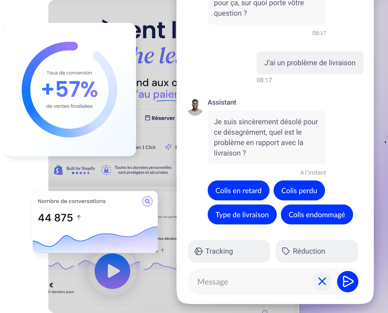
The example given by Shopify on Audio Advice is interesting: more complete comparisons, guides, and specifications helped improve conversion. The principle is simple. The more committed the decision, the more the page should help intelligently, without overwhelming the user. A conversational layer like Qstomy Sales can also complement this role when the buyer has specific questions before adding to cart.
Test one variable at a time and measure at the appropriate level
Shopify recommends choosing one primary KPI per test on product pages. That’s excellent discipline. If you test everything at once, you no longer know what actually improved the page.
The most useful metrics to track
Product page conversion rate.
Add-to-cart rate.
Cart → checkout progression.
AOV as a guardrail.
Return rate as a guardrail.
A better add-to-cart rate is not necessarily a real improvement if the return rate then spikes. That is why Shopify emphasizes one primary KPI and guardrails. In practice, start often with the most visited product pages, improve one element at a time, then roll out what works to similar products.
In what order should you test?
On many stores, the most profitable order looks like this: first the CTA and purchase block, then the images and variants, then reassurance, then the description, then deeper content. This sequencing avoids spending time on secondary refinements while the page is still blocked by its fundamentals. The idea is simple: first fix what prevents the user who is ready to buy from acting immediately.
Key takeaways, sources and FAQ
In short
Optimizing a product page for conversion is mainly about reducing hesitation at the most critical point in the journey. The strongest levers are usually the most fundamental ones: a clear CTA, good visuals, easy-to-understand variants, a useful description, visible reviews, credible trust signals, a good mobile experience, and a disciplined testing method. A good product page does not need to be spectacular. It needs to help the user make a confident decision.
The CTA, images, and clarity remain the priorities.
Variants and reassurance often make the difference.
Mobile can break a good product page if nothing is designed for it.
Useful SEO also strengthens understanding and conversion.
You need to test on the most visited pages before rolling it out more broadly.
Why this topic matters for Qstomy
The product page is where many buyers still have one or two questions that block the decision: differences between variants, real-world use, delivery time, returns, compatibility, or choosing between several references. This is exactly where an assistant like Qstomy can help turn hesitation into action by answering objections or selection questions immediately and in context. To go further: AI sales assistant, AI customer support, Shopify integration, demo.
External sources
Shopify Blog : Boost Sales with Product Page Optimization (2026).
Shopify Blog : 18 Best Product Page Design Examples for Inspiration in 2026.
Shopify Blog : How To Write a Product Description (Examples + Template) (2026).
Shopify Blog : SEO Checklist: 50 Tips to Optimize Your Website (2026).
Google Search Central : Introduction to Product Structured Data.
Google Search Central : Merchant Listing Structured Data.
Google Search Central : Product Variant Structured Data.
FAQ
What is the most important element of a product page that converts?
There is no single magic element, but Shopify recommends starting with the fundamentals: a visible CTA, strong visuals, a good description, reviews, and mobile usability. These are often what reduce hesitation the fastest.
Should you put a lot of text on a product page?
Not necessarily a lot, but enough to answer the real purchase questions. The most important thing is that the content is useful, specific, scannable, and suited to the product’s level of complexity.
Do customer reviews really increase conversion?
Yes, very often, because they act as social proof and reduce doubt. They are especially useful for reassuring customers about perceived quality, real-world use, and the experience of previous buyers.
How do you optimize a product page for SEO without hurting conversion?
By using unique, clear copy, a descriptive title, well-optimized images, and structured product data. SEO best practices help most when they also improve product understanding.
What should be measured after a product page change?
First and foremost, conversion or the add-to-cart rate on the page in question, then guardrails such as AOV and return rate. The goal is not just to get more clicks, but to sell better.
Go further

Enzo
April 22, 2026