E-commerce
May 6, 2026
E-commerce web design is the set of decisions that structure your online store so that visitors understand the offer, trust it, find the right product, place an order without unnecessary friction, and remember the brand positively. It is not just « a pretty visual »: it is a combination of information architecture, interface, content, performance, and mobile consistency that serves both the customer experience and business goals.
This guide sets out a clear definition, the differences from related notions (branding alone, pure development), the critical page areas on an e-commerce site, and the mistakes that hurt conversion. You will know what to demand from a redesign or a theme before approving isolated mockups.
To go further with a site-focused angle, our article e-commerce website design complements this reading. For general UX: improving web UX and design mistakes that hurt conversion.
Internally, it is useful to distinguish digital product design (prioritizing journeys, validation through testing) and art direction (visual universe). In a store, these two worlds must converge: strong art direction does not make up for unreadable navigation, and a utilitarian information architecture without identity does not build the brand memorability needed for repeat purchases.
Summary
Definition: e-commerce web design, what it really covers
E-commerce web design can be defined as the discipline that aligns user journeys, visual presentation and complexity management on a site whose main purpose is to sell or generate qualified leads through a cart. It typically covers navigation, page templates (home, categories, product detail page, cart, checkout), recurring components (filters, badges, CTAs), typography and color palette, as well as responsive layout rules.
1. E-commerce design is not just the homepage
Many brands invest in a spectacular homepage and then neglect broken mobile filters or poor product pages. Retail design is judged on the entire journey to payment.
2. Distinction from front-end development
Design defines intent and templates; development makes them reliable (performance, technical accessibility, browser compatibility). The two teams must work together from the first wireframes.
3. Distinction from brand strategy
Branding sets the tone, values, and overall visual universe; web design translates them into actionable screens without sacrificing readability and hierarchy.
4. B2B specifics and complex catalog
When your buyers are professionals with internal approval, quantity tiers or quotes, design must incorporate B2B journeys: account access, professional favorites lists, dense but scannable comparison tables, exports or callback requests without drowning the user in fifty fields at once. Complexity exists in the data; design reveals it in stages rather than displaying everything at once.
5. Deliverables and product trade-offs
Beyond static mockups, e-commerce design produces annotated wireframes, empty-state and error specifications, responsive grids and, ideally, a clickable prototype for high-risk journeys like checkout or a long B2B form. The trade-off with product and operational teams decides when critical information is missing in the data: better a cautious label and a link to support than an empty field that blocks the purchase decision.
Merchandising design goals: clarity, trust, conversion, memorability
A high-performing e-commerce design aims for several competing objectives that must be balanced: showcase the brand's personality while keeping journeys clear, highlight products and offers without cognitive overload, and reduce anxiety before payment (delivery, returns, security).
1. Clarity of the offer
In a few seconds, a visitor must understand what you sell, for whom, and why you rather than a visible substitute. The design supports this reading through visual hierarchy and short, useful text.
2. Trust
Accessible legal notices, reviews, guarantees, sharp photos, price consistency: the design places these signals in the right places without hiding the substance under decoration.
3. Responsible conversion
CTAs and cart shortcuts help, but an “aggressive” design (stacked pop-ups, fake urgency) can destroy trust and perceived SEO. For the conversion framework: improve the conversion rate and why CRO matters.
4. Consistency with other channels
The same visual promise must carry through ads, emails, and landing pages: digital e-commerce marketing reminds us how design supports or contradicts campaigns when the click lands on a page that “doesn't look like” the ad.
Information architecture and navigation: the invisible skeleton
Before colors and photos, e-commerce design starts with the information architecture: which categories, which subfamilies, how to filter without overwhelming the user on a SaaS platform or a catalog with thousands of SKUs.
1. Menus and mega-menus
They must reflect the customer's purchasing logic, not just the warehouse's internal organization. Test with real users or at least with scenarios like « I'm looking for X ».
2. Breadcrumbs and orientation
On product and category pages, the breadcrumb reduces disorientation and helps SEO when structured correctly.
3. Internal linking
Linking useful guides, related categories and complementary products is part of journey design: see e-commerce internal linking.
4. Search and zero-results state
The search bar occupies a strategic place on mobile and desktop: helpful placeholder, suggestions, typo tolerance. The design must provide a zero-results screen that offers nearby categories and contact rather than a harsh blank state. It's as much design as algorithm.
5. Footer and legal « moments of truth »
Terms and conditions, return policy, legal notices: visible without a treasure hunt. It's not glamorous, but it affects trust and support load.
Listing and search pages: where design meets the catalog
Listing pages (PLPs) are often the first contact with your filtered assortment. Effective design balances information density (price, promotions, reviews, availability) and readability on small screens.
1. Filters and facets
Poorly ordered filters or ones that reload the page in a confusing way ruin the experience. Plan for clear active states, result counts, simple reset.
2. Product grid and thumbnail photos
Blurry or randomly cropped thumbnails break trust. For Shopify-side image processing: Shopify image resizing.
3. Sorting and defaults
The default sorting should reflect your strategy (margin, novelty, popularity) without trapping the user in an opaque ranking.
4. List and grid views
Offering a list toggle with key attributes helps some technical verticals; other luxury brands prefer a wide grid. The design depends on the decisive information type for the shopper.
5. Badges and promotions
Sales, new arrivals, eco-score, upcoming stockout: codify stable colors and shapes so the eye quickly learns the legend without re-parsing each thumbnail.
6. Loading, skeletons and pagination
Placeholders or skeleton screens during loading avoid the impression of a frozen page. If you choose infinite scroll rather than numbered pages, the design must provide a quick return to the top, a progress indicator and access to the footer; otherwise some users will never reach your useful or legal links.
Product pages: the heart of transactional design
The product page concentrates purchase decision, objections, and proof. The design must present critical information (price, variants, delivery times, returns) without scrolling through ten screens before the main button on mobile.
1. Mobile hierarchy
Photo, title, price, availability, CTA, then details: a logical order for many verticals, to be validated for yours.
2. Variants and user errors
Unavailable colors grayed out, clear messages if a combination is impossible: the design avoids post-click frustration.
3. Practical guides
To go further: UX best practices for product pages and optimize a page to convert.
4. Proof blocks and UGC
Reviews, customer photos, aggregate ratings: the design balances density and authenticity. Too many competing blocks dilute attention; too few on a technical product create friction in the decision.
5. Cross-sell and bundles
“Frequently bought together” must remain relevant: algorithms or merchandising need to be validated in design to avoid absurd recommendations visible above the shipping costs once the threshold is reached.
Cart and checkout: minimalist design that builds trust
The checkout flow often calls for a more restrained design than the rest of the site: fewer distractions, complete transparency about fees, shipping, and delivery times, reassurance about payment security.
1. Clear summary
Summarize products, quantities, promo codes without breaking the total: avoid unpleasant surprises on the final screen.
2. Forms
Group fields logically, explain errors inline, allow flexible address entry depending on the country.
3. Resources
checkout optimization and abandonment, customize the Shopify checkout, increase Shopify checkout conversion.
4. Guest checkout and account creation
The design should make the guest path at least as smooth as the account path when the brand allows it: forcing sign-up too early is a business decision that should be translated into an explicit design screen with account benefits (tracking, history) rather than an invisible wall.
5. Payment methods and logos
Showing recognized logos at the right step reassures without cluttering: order and alignment matter for the perception of security.
Mobile first, perceived performance, and surface-level SEO
A large share of e-commerce traffic is mobile: design must be thought of small-screen first, not adapted after the fact like a glued-back dried plant.
1. Touch targets and gestures
Sufficient clickable areas, no elements too close together, natural scroll toward CTA.
2. Media weight
Heavy carousels and autoplay videos sabotage LCP and user patience. Design must negotiate with performance.
3. Strategic mobile first
Read mobile-first design strategies. For SEO impact on the content and technical side: improve the site's SEO.
4. Perceived performance indicators
Speed measurement tools and Core Web Vitals-style reports guide where to lighten media or scripts on the design side. Even without a universal magic number, the goal remains fast response on first render and visual stability during loading to limit accidental clicks.
5. Progressive enhancement
Design must plan for graceful degradation when JavaScript fails or the network is weak: essential content and CTA still understandable.
Web fonts, third-party iframes and consent banners can shift content on display: reserving the space shown in mockups limits layout shifts that tire the thumb on mobile and harm the perception of quality.
Accessibility, content and personalization: inclusive and relevant design
Professional design takes into account readable contrasts, font sizes, useful text alternatives for product images when they convey information, and a coherent heading structure for screen readers.
1. Content and design
Size guide blocks, comparison charts, FAQs: design must integrate them without relegating them to unreadable content at the bottom on mobile.
2. Reasonable personalization
Dynamic recommendations, “picked for you” blocks: useful if data is reliable. See e-commerce personalization.
3. Overall customer experience
Design supports the service promise: improving the customer experience and exceptional customer experience.
4. Visual internationalization
Currencies, date formats, reading direction, text lengths in translation: design must accommodate flexible templates without breaking the grid when a language expands by thirty percent.
5. Keyboard, focus, and modals
Focus traps in promo windows, carousels that block tabbing, or menus that do not close with the keyboard exclude part of buyers and complicate compliance. Providing a logical tab order and explicit closing is part of the requirements from the design stage, not just a fix after launch.
Design system, theme, and scalability: thinking long term
The shops that grow move away from the « one-shot mockup » toward a design system: component library, button states, grids, spacing rules. This speeds up page additions and avoids visual inconsistency months after launch.
1. Shopify theme or equivalent
Choose a technical foundation that supports your modules without a crazy JavaScript layer. For the platform context: Shopify growth guide.
2. Testing and iteration
Design is alive: reasonable A/B tests on CTA, block order, wording. For examples: e-commerce conversion case studies.
3. Omnichannel consistency
Web design should recall the physical store or packaging without blindly copying constraints that are unsuitable for scrolling.
4. Headless, CMS and front-end freedom
Some architectures separate back end and front end: design gains freedom but takes on more performance responsibility. For platform framing: e-commerce CMS comparison.
5. Governance and tokens
When several teams publish blocks, drift happens quickly: two button styles, three heading hierarchies, inconsistent margins. A documented design system with allowed and forbidden examples, plus a short review before going live, prevents the site from turning into a collage after a few months. Clearly naming colors, radii, and spacing helps contributions without having to remind the original creative every week.
Common mistakes: when decorative design kills the shop
Some pitfalls recur often, regardless of product quality.
1. Unreadable trendy typography
Fancy fonts in body text reduce readability and price credibility.
2. Too many animations
Parallax and micro-interactions can distract or cause motion sickness for some users.
3. Hiding prices and fees
Putting fees off until the last screen destroys trust; design should build in transparency early.
4. Neglecting the empty state
An empty cart, no search results, stockouts: planned, useful screens avoid dead ends.
Dedicated list: design errors that hurt conversions.
5. Poor error hierarchy
Generic error messages like “an error occurred” without corrective action lose sales. Design provides explicit states: invalid field, out of stock, payment declined with the next step.
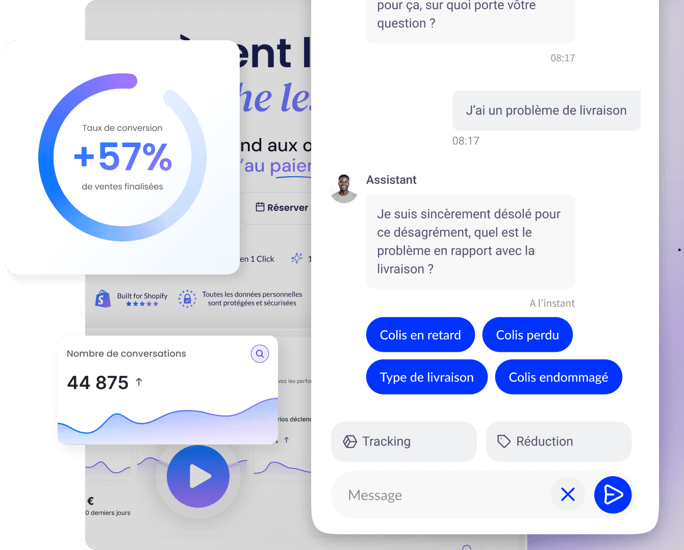
Qstomy: the design is welcoming, and conversation can remove the remaining obstacles
Even with careful design, visitors hesitate over recurring questions (size, compatibility, precise delivery times). A chat or assistant well integrated into the design extends the journey without breaking the visual hierarchy.
Qstomy offers an AI conversational assistant for e-commerce, integrated notably with Shopify, to answer frequently asked questions and guide users to the right pages, in line with your teams sales and support. Conversation data enriches e-commerce analytics. Demo · Plans.
Summary, FAQ, and further reading
In brief
E-commerce web design : visual structure and journey in service of online sales.
Priorities : navigation, listing, product page, checkout, mobile, performance.
Trust : price transparency, proof, useful error states.
Scalability : design system and testing rather than perpetual redesign.
FAQ
Should you have a unique design or follow market patterns?
Innovating on the brand while respecting user conventions (cart in the top right, etc.) limits the learning curve.
Does design influence SEO?
Yes indirectly: speed, mobile, clarity of headings and useful content contribute to perceived quality; see also e-commerce site success.
Where should you start a redesign?
Checkout and bestseller pages before the homepage, unless there is a major awareness problem.
How do you measure good design?
Conversion rate by device, useful scroll depth, cart abandonment rate, support feedback, time on task for key scenarios.
Does web design replace user research?
No: it feeds on it. Menu labels, filter order, and wording of error messages are best tested with real journeys and cross-checked with analytics. Without this foundation, design remains an opinion; with validated scenarios, it becomes a measurable lever.
Should design imitate general marketplaces?
Keep the conventions (cart location, filter logic), not necessarily their visual clutter: your brand needs distinctive, readable landmarks.
How should you position your results against the market?
Compare cautiously with sector benchmarks: conversion benchmarks 2026 and good Shopify conversion rate.
To go further

Enzo
May 6, 2026