E-commerce
October 1, 2026
Wondering how information design guides your visitors toward a purchase? The answer lies in one sentence: every element on your page must respond to a specific intent of your visitor, from the very first second to cart validation. Good information design is not just aesthetic; it tells a coherent story that transforms interest into action.
The trap? Copying a generic template without thinking about the order of the sections. Your products, your audience, and your level of brand awareness require a unique architecture. Examples from WildGrain, Speks, Athena Club, or Athletic Greens show radically different approaches, all of them effective because they are aligned with a clear objective.
So how does information design guide your visitors toward a purchase? On the agenda:
Why is information architecture crucial for converting?
Which elements should be placed first to capture attention?
How do you use social proof to reassure without overloading?
What structure should be adopted for products that require education?
How does Qstomy help refine this journey for your customers?
Let's go.
Summary
Why is information architecture crucial for converting?
Information architecture determines the order in which your visitors discover your arguments. A visitor arrives with a goal: to find a product, understand its use, or verify its reliability. If your page does not meet these expectations in the first few seconds, they leave.
Think of your homepage as a funnel. Each section must answer an implicit question: "Why you?", "Why this product?", "Why now?". A standard template often offers a slogan, featured products, then testimonials. But this sequence only works if it matches your audience.
For a site like WildGrain, the emphasis is on education and desirability. For Athena Club, ingredient transparency is paramount. Your architecture must reflect your unique value proposition, not a generic formula. By taking the time to map out your visitors' expectations, you create a seamless journey that naturally leads them to action.

Convert over 2,000 customers on average per month with Qstomy.
The world’s 1st Shopify AI dedicated to customer conversion


Empowering 200+ e-commerce merchants
Which elements should be placed first to capture attention?
The first few seconds are decisive. The top of your page must immediately answer three questions: "What is it?", "Why should I care?", and "What should I do?". A clear benefit, simple navigation, and a visible call to action are all it takes.
WildGrain opens with "Free Shipping Always" and "Free Sourdough Rolls For Life", two concrete benefits. Speks uses "Spectacularly magnetic" to spark curiosity. Athena Club chooses "Self-care Reimagined" to establish its positioning. Each phrasing is short, direct, and visitor-oriented.
Your call to action must be just as explicit: "Get Started", "Shop Spectrum", "Shop It All". Avoid vague phrasing. The visitor must know immediately what action you expect from them. A clear message right from the start reduces hesitation and increases the chances of a click.
How to structure the navigation to simplify the user journey?
Navigation is the backbone of your information design. It should reflect your buyer's natural journey, not your internal organizational chart. A simple and visual navigation helps the visitor find their way effortlessly.
Some sites opt for a discreet hamburger menu, others for visual navigation with product images. The choice depends on your catalog and your audience. A site like Speks, with visual products, favors image-based navigation. A more editorial site may prefer a classic menu.
The goal is to reduce cognitive load. Every click should bring the visitor closer to the purchase, not push them away. Test different formats and observe behaviors to find the right balance. Well-thought-out navigation turns exploration into a pleasant and intuitive experience.
How to use social proof to reassure without overwhelming?
Social proof is a powerful conversion lever, but its placement and form vary. Some sites place it at the top, others lower down, and some repeat it in several places. The key is to adapt it to your level of notoriety.
WildGrain displays press references, Speks shows "Who’s talking about us," Athena Club combines media mentions and customer reviews, and Athletic Greens uses customer testimonials. Each format meets a different need: credibility, desirability, or reassurance.
Do not overload your page with social proof. Select the most relevant ones for each step of the journey. A visitor at the beginning of their consideration will need proof of credibility, while a hesitant visitor will need detailed testimonials. Well-balanced social proof strengthens trust without distracting.
What level of importance should be given to product benefits on the page?
Product benefits should not be drowned in a block of text. They must be visible, prioritized, and formulated from the customer's perspective. "Free shipping" is a benefit, "superior quality" is a claim.
Some sites place the benefits at the top, others integrate them into graphical sections further down. WildGrain highlights free shipping, Speks emphasizes the magnetic nature of its products, Athena Club talks about "better everyday essentials." Each benefit is formulated simply.
The visual representation of benefits is just as important. An icon, an image, or a short phrase can be enough. The goal is to allow the visitor to quickly understand what they gain by buying from you. Clear and attractive benefits facilitate the purchasing decision.
How to overcome objections directly on the homepage?
Objections are the obstacles that prevent a purchase. Addressing them directly on your homepage is an effective strategy. WildGrain dedicates an entire section to '6 Reasons to Try WildGrain This Winter', while Athletic Greens explains its quality standards.
Identify your customers' most common objections: price, quality, delivery times, ingredients. Create sections that explicitly address them. For Athena Club, transparency about ingredients is a central argument. For Athletic Greens, it is the rigor of manufacturing standards.
This approach reduces your customer service workload and accelerates decision-making. The visitor doesn't need to look for information elsewhere; it is already there, in the right place. By anticipating doubts, you show that you understand your customers and are ready to support them.
How to integrate the brand's mission into the journey?
Your brand's mission humanizes your site and creates an emotional connection. It answers the question "Why do you exist?". WildGrain presents "Our Purpose", Speks explains "Goodbye fidget spinners", Athena Club details its vision of self-care.
This section is not just filler text. It must reinforce your value proposition and reassure about your intentions. A clear mission can justify a higher price or a different approach.
Place it strategically, often after the benefits and social proof. The visitor has already understood what you sell, they can now understand why you sell it. This sequence creates a logical progression towards engagement. An authentic mission transforms a simple purchase into an alignment with values.
What role does the community play in conversion?
Community is a form of dynamic social proof. It shows that your customers are not just buyers, but active participants. Speks invites people to share their creations, while Athletic Greens encourages joining "#LiveAG1".
This section creates a sense of belonging and shows that your brand is alive. It can also generate user content, which is valuable for your SEO and your credibility.
Integrate community calls to action at key moments of the journey. After purchase, it is an excellent way to build loyalty. Before purchase, it can be the trigger that reassures a hesitant customer. An engaged community becomes a lasting asset for your brand.
How to use lead magnets to extend engagement?
Lead magnets, like newsletter sign-ups, are long-term conversion tools. They turn a passive visitor into a qualified contact. WildGrain offers tips and recipes, Speks "Get the scoop", Athena Club offers 20% off.
The offer must be consistent with your brand identity. A discount works for everyday consumer products, exclusive content for brands with a strong identity. The goal is to create a reason to return.
Place these calls to action at times when the visitor is most receptive, often after having consumed content or discovered your products. Do not force them from the very first second; integrate them naturally into the user journey. A well-placed magnet nurtures the relationship and prepares for future conversion.
How to adapt information design to your sector?
There is no single model. WildGrain, Speks, Athena Club, and Athletic Greens have different architectures because their products and audiences are different. Your design must reflect your reality.
A complex product requires more education, and therefore more explanatory sections. A simple product can focus on benefits and social proof. A sensitive product, like cosmetics, must highlight ingredient transparency.
Analyze your pages, customer journeys, and conversion rates. Identify sections that work and those that create friction. Every adjustment must be guided by a clear intention. By adapting your design to your industry, you maximize the impact of each element.
How does Qstomy help refine this journey for your clients?
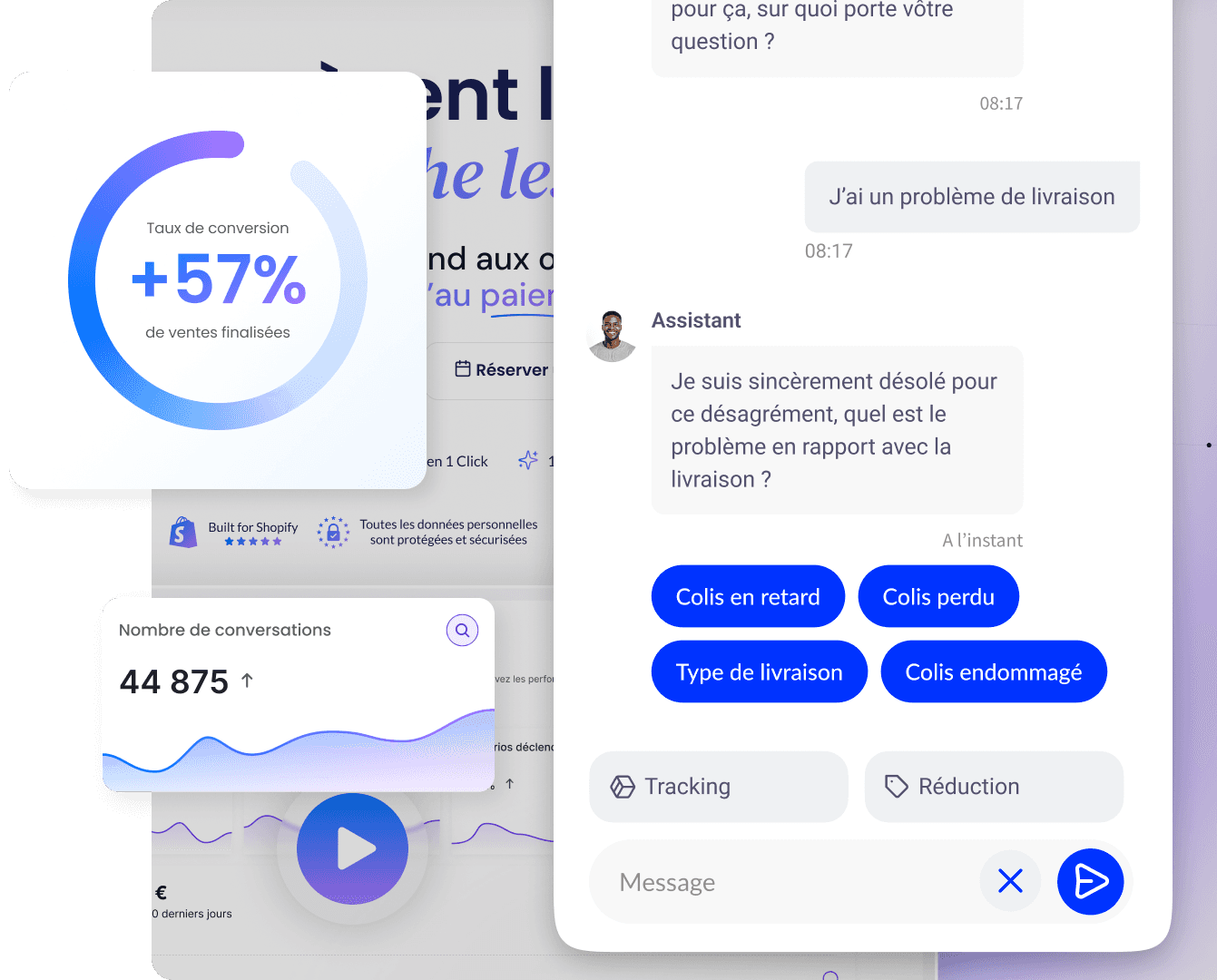
Qstomy, a Shopify AI agent, completes your information design by guiding your customers at every step of the journey. It answers questions before purchase, recommends products, manages the cart and package tracking, and handles post-purchase service requests.
Concretely, Qstomy reduces the friction that your page design cannot always anticipate. A hesitant customer can ask a specific question and get an immediate answer. An undecided customer receives personalized recommendations. A worried customer tracks their package without leaving your site.
By integrating Qstomy, you extend your information design experience beyond the page. Every interaction becomes an opportunity to convert, build loyalty, and improve your satisfaction rate. With Qstomy, your site becomes a space for continuous dialogue with your customers.
What checklist should you use to optimize your website's information design?
Before launching a redesign, verify these essential points:
Clear benefit: your value proposition is visible from the very first screen.
Intuitive navigation: the visitor finds their bearings within seconds.
Explicit call to action: each section proposes a clear action.
Adapted social proof: testimonials and mentions are placed strategically.
Addressed objections: common barriers are resolved directly on the page.
In brief
Information design is a powerful conversion lever. Each section must have a precise objective and fit into a coherent journey. Test, measure, adjust.
FAQ
Should you follow a standard template? No, adapt the architecture to your products and your audience.
Where to place social proof? In several strategic locations, depending on the level of brand awareness.
How to handle objections? Create dedicated sections that address the most common barriers.
To go further: Pre-purchase questions in e-commerce: 30 objections to address on your site - Qstomy, Building your SEO strategy: adapt to succeed - Qstomy, E-commerce SEO strategy for category pages - Qstomy, How to create a payment gateway for an e-commerce site? - Qstomy, How does SEO work for e-commerce sites? - Qstomy, How to optimize an e-commerce site for Google (step-by-step guide) - Qstomy, Why use social media for e-commerce customer service? - Qstomy.

Enzo
October 1, 2026