E-commerce
April 8, 2026
The question « how to increase the conversion rate » comes up in almost every e-commerce team. The traffic is there, the campaigns are running, the content is being published, but revenue is growing more slowly than expected. In many cases, the problem does not come from a single blocking point. It comes from a set of small frictions: a vague marketing promise, a product page that is too thin, fees revealed too late, a painful mobile checkout, or a lack of reassurance at the wrong moment.
This guide answers the question directly. Not with a list of tips out of context, but with a realistic order of action: qualify the traffic better, clarify the offer, simplify the journey, reassure people in the right place, take mobile seriously, then test what is worth deciding on. The goal is not only to increase a percentage. The goal is to increase a cleaner revenue, more profitable and more sustainable.
What you'll be able to do: identify the levers that can increase conversion without spreading yourself too thin.
What you won't find: a magical average that works for all sectors, all countries, and all average order values.
Related to: improving e-commerce conversion rate, increasing checkout conversion, and improving conversion rate optimization.
If you're looking for where to start, keep this idea in mind: conversion rarely goes up because of a single spectacular isolated effect. It rises more often when several visible frictions disappear in the right order.
Summary
First and foremost: define what you really want to increase
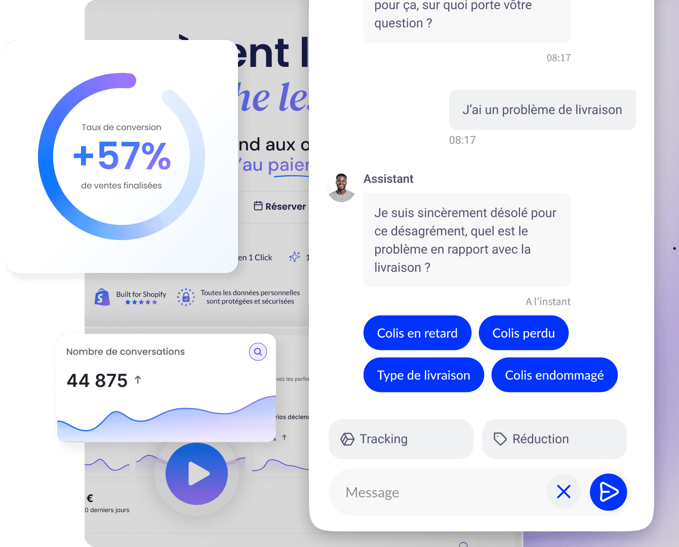
Before trying to increase the conversion rate, you need to know which conversion you are trying to improve. In e-commerce, this may be orders, add-to-carts, checkout starts, leads, trials, or quotes. Many teams talk about « conversion » as if it were a single metric, then discover too late that they were not all optimizing the same stage.
The first clarification step is therefore to choose a primary conversion and a few secondary metrics. For example:
Primary conversion : orders / sessions.
Secondary metrics : add-to-cart, checkout start, average cart value, return rate.
Essential segments : mobile, desktop, country, new visitors, returning customers, paid traffic, organic traffic.
Why this step avoids mistakes
A campaign can increase add-to-carts and decrease orders if traffic is poorly qualified. A checkout improvement can increase orders while lowering average cart value. A promotion can raise the displayed rate, but hurt margin. Without a clear definition, you may believe that conversion is improving when revenue quality is deteriorating.
A common baseline for the team
Marketing, management, support, and operations must read the same numbers with the same vocabulary. To frame the metrics, our article on e-commerce conversion rate definitions helps establish stable foundations before launching more visible projects.
First lever: attract traffic closer to making a purchase
You cannot sustainably increase the conversion rate if a large share of traffic is not aligned with the offer. It is often the most underestimated lever. A perfect page will convert poorly if the visitor was not the right one to begin with, or if the campaign promise does not match what they discover on the site.
The signals of misaligned traffic
High bounce rate on strategic landing pages.
Very low time on page despite costly campaigns.
A large gap between new visitors and repeat customers.
Mismatch between the ad message and the price, lead time, or actual offer.
How to fix it
First work on aligning the acquisition promise with the landing page. If the ad promises speed, the proof must be visible right away. If it promises savings, the calculation must be clear. If it targets a specific need, the page must address that need directly. This is often more profitable than a design overhaul.
Differences by channel matter too. Informational SEO traffic, email, retargeting, and cold social campaigns do not arrive with the same level of intent. You therefore need to read conversion by source and by segment. The Shopify guide on e-commerce conversion rate also notes that overall comparisons have little value if you forget the traffic context.
A concrete example
A team thinks its product page is underperforming. In reality, the campaign is sending very broad traffic with a promise that is too vague. Once the campaign angle is narrowed and the landing page better aligned, the rate rises without any major change to the funnel.
Second lever: clarify the offer and the value proposition
A visitor converts more easily when they very quickly understand what you sell, for whom, with what main benefit and under what conditions. Many pages lose conversions not because they are ugly, but because they are ambiguous. Too many promises, not enough hierarchy, or a message centered on the brand instead of the customer problem.
What must be clear in a few seconds
What it is: the product or offer.
For whom: customer type, need, or use case.
Why now: main benefit, gain, proof, or real urgency.
Under what conditions: price, timeline, delivery, return, demo, trial.
Avoid message overload
A page that tries to say everything often says the essentials badly. If your hero section, benefit blocks, social proof, FAQs and CTAs tell five different stories, conversion drops because the user has to reconstruct the meaning of the journey themselves.
Clarity also matters for complex offers
For technical products, subscriptions, B2B offers or large catalogs, clarity becomes even more important. The visitor must know what to expect before committing. For Qstomy, for example, the positioning must remain legible: AI sales and support agent for e-commerce, not just a generic chatbot. The clearer the proposition, the faster the right audience moves forward.
Third lever: strengthen product pages and key pages
A large part of conversions is decided even before the cart. Product pages, offer pages, landing pages, and sometimes comparison pages absorb most objections. If these pages are too weak, the rest of the funnel works with a handicap.
What often increases conversion on a product page
Useful visuals: detail, context, scale, usage, short video if relevant.
Concrete information: features, dimensions, compatibility, materials, limits.
Visible reassurance: delivery, returns, warranty, contact, timeframe.
Credible proof: nuanced reviews, demonstrations, use cases, answers to common objections.
Why help pages matter too
Buying guides, FAQs, support pages, and reassurance content are not "outside conversion." When properly linked, they reduce cognitive load before adding to cart. Good internal linking prevents the visitor from leaving to check elsewhere what your site could answer itself.
Google emphasizes, through its recommendations on the helpful content, that good content should help the user. That's exactly what a page that converts does: it helps decide, not just read.
Example
If visitors are still hesitating about the return policy, adding a clear sentence near the CTA or a well-placed FAQ block can do more than changing the color of the add-to-cart button.
Fourth lever: reduce friction in the cart and checkout
Once purchase intent is formed, the user wants to move forward without surprises. This is where many conversions are lost: fees discovered late, forced account creation, missing payment methods, cumbersome forms, vague error messages. Research by the Baymard Institute has long shown that these causes remain among the most important.
The most common improvements
Make costs visible earlier: fees, taxes, delivery times, options.
Offer guest checkout: especially for the first purchase.
Streamline forms: fewer fields, better autocomplete, less re-entry.
Adapt payments: according to the country, average order value, and customers' actual habits.
Clarify errors: the user should immediately understand what to fix.
Do not attribute all abandonments to price
Leaving at the payment stage is not always a refusal to pay. It can be caused by slowness, discomfort, doubt, or the absence of a preferred payment method. That is why our guide on checkout conversion usefully complements this section by detailing funnel friction.
The right order
If your main leak is between cart and payment, start with the checkout before reworking the homepage. Fixing the last major friction often delivers a faster return than a broader upstream project.
Fifth lever: treat mobile as a fully-fledged channel
Mobile often accounts for the majority of sessions, but it is also more fragile: smaller screen, intrusive keyboard, interruptions, variable network, shorter attention span. If you are looking to increase conversion rate without looking at mobile's share in your exits, you are often missing a major lever.
What you should check first
Immediate readability: promise, price, CTA, summary, policies.
Keyboard behavior: does it hide critical fields or buttons?
Weight of third-party scripts: pixels, pop-ups, widgets, apps, tests.
Quality of validations: visible errors, immediate feedback, clear progression.
Performance and perceived experience
Google uses the Core Web Vitals as experience benchmarks. A satisfactory LCP is 2.5 seconds or less, and a satisfactory INP is 200 milliseconds or less. These thresholds do not guarantee high conversion, but they help to objectively identify pages that are too slow or too heavy.
Test on real devices
Responsive behavior seen on a large screen is not enough. Test on several real phones, with different screen sizes and imperfect network conditions. Many mobile conversion problems do not appear in a comfortable desktop environment.
Sixth lever: building trust at the right time
Conversion rarely increases without trust. The visitor wants to feel that they understand what they are buying, how much they are paying, what happens next, and who can help if something goes wrong. This trust is not built by piling up badges. It is built through credible clarity.
The signals that matter most
Clear pricing and total.
Visible returns and refunds.
Credible social proof: reviews, customer case studies, demos, references.
Accessible support contact: before and after purchase.
Brand continuity: no impression of being sent into a dubious environment.
Avoid gimmicks
Artificial urgency, fake counters, or unconvincing labels can sometimes produce a short-term effect, but they damage trust. A conversion increase achieved at the cost of more disputes or returns is not real progress.
Reassure differently depending on the stage
At the top of the funnel, the user is mainly trying to understand. At the bottom of the funnel, they want to be reassured. The right information at the right time increases conversion more reliably than the same message repeated everywhere.
Seventh lever: use useful tests and hypotheses
Increasing conversion rate doesn’t mean constantly testing everything. A/B tests make sense when you have enough traffic, a clear hypothesis, and an isolable change. Otherwise, they can create a false sense of rigor.
When a test is worth it
You have a real signal: a drop at a step, repeated objection, observed behavior.
The variation addresses a plausible cause, not an aesthetic preference.
You have a guardrail: average order value, margin, returns, support tickets.
When it’s better to fix it directly
A mobile bug, a missing payment method, hidden fees, or misleading copy do not need a test to justify a fix. These are obvious frictions. Good CRO also means knowing when not to turn a clear problem into unnecessary experimentation.
Documenting for reuse
Optimization becomes more powerful when each change documents what was learned: for which segment, with what effect, and with what trade-offs. This is what then makes it possible to improve real conversion rate optimization, beyond a one-time gain.
Eighth lever: linking conversion, margin, and revenue quality
Improving conversion only makes sense if revenue quality holds up. A very aggressive discount can increase the rate, but attract unprofitable customers. An overly optimistic promise can win orders and cost dearly in support, cancellations, or returns. A good read of conversion must therefore stay tied to economic reality.
The guardrails to follow
Average order value: does the rate rise at the expense of a lower basket?
Net margin: does the apparent gain hold up once discounts, fees, and returns are accounted for?
Returns and cancellations: does the improvement create misaligned expectations?
Repeat purchase: do acquired customers come back or not?
The right trade-off
A mature team often prefers an improvement that is a bit slower, but healthier, over a quick spike that damages profitability. This is also what makes conversion sustainable: the marketing promise, the site experience, and operational execution remain aligned.
Ninth lever: use support and AI to address doubts
A significant share of non-conversions comes from unanswered questions: size, compatibility, stock, delivery, returns, timing, use, installation. If the user does not find the answer in time, they postpone their decision or go check elsewhere. To increase conversion, you also need to reduce the time between the question and the answer.
Qstomy plays exactly this role: an AI sales and support agent connected to the catalog, policies, and site content. It can answer common objections, recommend a product, reassure customers about delivery or returns, then hand off to a human with context if needed.
For Shopify: Shopify integration.
To discover the product: request a demo.
For the framing: why use an AI chatbot for e-commerce.
A conversion and learning lever
Questions asked in the conversational channel also serve as raw material for the roadmap: if the same objections come up every week, they should inform your pages, product sheets, FAQs, and CRO choices.
Where should you start if you want a quick result?
When everything seems a priority, it's better to start again from a simple order:
Check traffic: is the acquisition promise aligned with the landing page?
Look at the pages that drive revenue: product pages, cart, checkout, offer pages.
Isolate mobile: that's often where the biggest gaps hide.
Remove obvious frictions: hidden fees, overly heavy forms, support impossible to find.
Add a short learning loop: data, tickets, sessions, decisions.
If you only have one project to start this week, choose the one that combines three criteria: high impact, already visible friction, and reasonable effort. In many stores, that project is neither the logo nor the homepage. It's a decision area much closer to the sale.
Example of prioritization
A brand sees decent traffic and a good add-to-cart rate, but a steep drop before payment, especially on mobile. The right first project is not a new campaign page. It's simplifying the mobile checkout, making fees visible, and reassuring customers about returns.
Summary, sources and FAQ
In brief
Increasing the conversion rate is above all about removing the friction that slows down a decision that is already possible. In practice, this means: attracting more qualified traffic, clarifying the offer, strengthening key pages, simplifying the funnel, taking mobile seriously, reassuring users with credible proof, and connecting conversion to the actual quality of revenue.
Start with the context: traffic quality, conversion definition, segmentation.
Work on decision areas: product pages, cart, checkout, offer pages.
Address the major causes: hidden fees, ambiguity, lack of reassurance, mobile friction.
Add helpful responses: support, FAQ, AI agent, content delivered at the right time.
Sources (external)
Shopify: guide to e-commerce conversion rate.
Baymard Institute: cart abandonment statistics and research on checkout usability.
Google: helpful content and Core Web Vitals.
FAQ
What is the fastest lever for increasing conversion?
It depends on the main point of friction. Very often, the quickest gains come from better traffic / landing page alignment, clearer fees, or simplifying the checkout.
Should you work on mobile first or desktop first?
Prioritize the environment where your sessions and exits are concentrated. In many stores, mobile deserves immediate attention.
Do promotions always increase conversion?
They can raise the rate in the short term, but not always profitability. Their effect needs to be reviewed alongside margin, returns, and repeat purchases.
Why is my traffic increasing without conversion following?
Often because traffic quality is declining, or because the site is not fulfilling the promise made during acquisition well enough. The problem is not always volume. It is often alignment.
Can an AI agent help convert more?
Yes, if it quickly answers the doubts that block the decision and if it correctly redirects users to the right products, the right pages, or a human when needed.
Go further

Enzo
April 8, 2026