E-commerce
September 30, 2026
Are you wondering how to create email templates that truly convert? The answer lies in a single principle: every element of your email must reflect a unique and clear goal, that of guiding the reader toward the final action. A well-thought-out template eliminates friction, highlights value, and adapts to the behavior of each subscriber.
However, conversion does not rely on a single detail, but on a coherent whole: structure, images, the call-to-action button, and personalization. Neglecting even one of these aspects can cause your sales to drop. So how do you create email templates that truly convert? On the agenda:
Why structure your email around a single goal?
How to use images that reinforce your offer?
What is the best way to write a powerful call to action?
How to personalize your emails according to your audience segments?
What checklist to follow before sending a conversion email?
Let's get started.
Summary
Why structure your email around a single goal?
An e-commerce email must be designed as a direct path to a specific action. Before writing a single line, ask yourself what the ultimate goal is: to drive a purchase, encourage signing up for a webinar, or download a guide? Too many emails mix multiple intentions, which loses the reader and reduces conversions.
To avoid this pitfall, simplify. Highlight a single main offer and remove anything that could distract. For example, if your goal is to sell a product, do not drown the message in links to other categories. Every visual and textual element must serve this single objective.
Also, think about reducing barriers. The simpler the action, the higher the conversion rate. One click should be enough to add a product to the cart or apply a discount code. By eliminating superfluous steps, you facilitate the purchase decision.

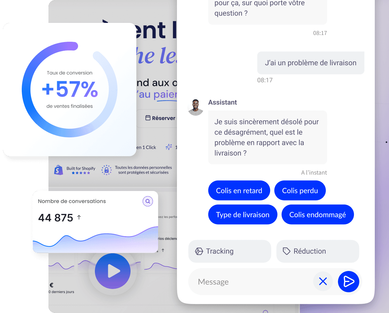
Convert over 2,000 customers on average per month with Qstomy.
The world’s 1st Shopify AI dedicated to customer conversion

Empowering 200+ e-commerce merchants
How can action be facilitated with clear and direct offers?
The offer must be immediately understandable. If the reader has to look for the promo code or guess the discount, they will give up. Integrate the discount code directly into the email link, so that a simple click automatically applies it to the cart. This approach removes a major point of friction.
Write short and explicit messages. "Save 20% on your next order" is more effective than a vague phrase. Avoid convoluted wording that forces the reader to think. Clarity is your best ally for converting.
Finally, limit the options. Offering too many choices in an email dilutes attention. Focus on a single main offer and a single click path. This simple strategy increases the likelihood that the recipient will take action.
Why adopt a responsive design for your emails?
The majority of your subscribers open your emails on mobile. A non-responsive template becomes unreadable on a small screen, and the reader quickly closes it. An adaptive design automatically adjusts the layout depending on the device, ensuring a seamless experience.
Many free and open-source tools allow you to create responsive templates. Your emailing platform often offers ready-to-use templates optimized for all screens. Use them to save time and avoid coding errors.
An email that is readable on mobile is an email that gets read to the end. Make sure buttons are large enough to be clicked with a finger and that images display correctly. This attention to detail directly improves your click-through and conversion rates.
How to choose images that reinforce your message?
Images are powerful, but they must serve your purpose. A relevant image that illustrates the offer has more impact than a large decorative photo. Visuals with people tend to convert better because they create an emotional connection.
Make all your images clickable. Every visual should lead to the destination page or the product concerned. This multiplies click opportunities without making the text heavier. Also, consider testing different images to see which ones generate the most engagement.
Use heat maps to analyze where eyes are drawn in your emails. This data tells you which images attract attention and which ones are ignored. Adjust your choices accordingly to optimize each campaign.
What is the importance of the value proposition in an email?
To build subscriber loyalty, every email must remind them why it is interesting to read you. A clear value proposition justifies opening your messages. It can take the form of free delivery, a discount in euros or as a percentage, or bonus loyalty points.
Highlight concrete and immediate benefits. Exclusive products or those difficult to find elsewhere are also an excellent reason to stay subscribed. Offer practical webinars or in-depth articles that bring real added value.
An effective example combines a promotional offer with a loyalty program benefit. This double incentive reinforces the appeal of the email and encourages the click. Perceived value is the driver of long-term engagement.
How to personalize your emails according to audience segments?
The best-performing emails are those that directly address the recipient's needs. Personalization is not limited to the first name; it must reflect the behavior and characteristics of each segment. Age, gender, location, life stage, or past purchases are all relevant criteria.
Content tailored to a specific segment resonates more. For example, an offer for single-person households will not be relevant for a large family. By segmenting your list, you send the right message to the right person, which increases conversions.
Segmentation also allows you to adjust the tone and visuals. A younger audience will react differently than an older audience. Take the time to analyze your data to create relevant segments and adapt your email templates accordingly.
How to write a call to action that makes people want to click?
The call-to-action button is the decisive element of your email. A simple change in formulation can have a major impact on the click-through rate. Keep the text short and use action verbs that encourage taking the next step.
"Get the discount" is more effective than "Buy now" because it emphasizes the benefit. Spark curiosity without demanding immediate commitment. Avoid terms like "download" or "register" which can seem restrictive.
Place your main button at the top of the email, visible without having to scroll. Offer multiple calls to action throughout the message to capture attention at different moments. Test different formulations to identify which one works best with your audience.
Why use buttons that are large enough for mobile?
On mobile, click accuracy is lower than with a mouse. A button that is too small becomes difficult to touch, which frustrates the user and makes them give up. The recommended minimum size is about 44 pixels in height, which corresponds to the width of a finger.
A spacious button improves the user experience and reduces click errors. Also, make sure there is enough space around the button to avoid accidental clicks on other links. This attention to navigation comfort is essential.
Test your emails on different devices to verify that the buttons are easily clickable. A thoughtful mobile design is an investment that translates into a direct increase in conversions.
How to use last-chance reminders and notifications?
Buyers tend to procrastinate. A reminder email can be the trigger that prompts them to finalize their purchase. Last-chance notifications, such as an offer expiring soon, create a sense of urgency that speeds up the decision.
Set up automated emails for visitors who clicked a link but did not complete their order. These behavior-triggered messages are highly effective for recovering lost sales. They remind the customer of what they left in their cart.
Personalize these reminders by mentioning the specific product viewed. This targeted approach shows that you understand the customer's needs. Well-designed follow-up campaigns can significantly increase your overall conversion rate.
How to continuously test and optimize your email templates?
Optimization is a continuous process. A/B testing is essential to discover what truly works. Test different elements: subject lines, images, button texts, or even the length of your message. Each variable can influence the click-through rate.
Analyze the results of each test to understand your audience's preferences. The data from your campaigns guides your future choices. Do not settle for a single version; iterate continuously to improve your performance.
Heatmaps and click reports give you a precise view of readers' behavior. Use this information to adjust the layout of your emails. Regular optimization transforms a good template into a highly performing one.
How does Qstomy help improve your email conversion?
Qstomy, the Shopify AI agent, complements your email campaigns by guiding your customers toward a purchase at every stage. Thanks to its personalized recommendations, it suggests complementary products or relevant alternatives, thereby increasing the average basket size. This approach enhances the effectiveness of your emails.
The agent also assists with parcel tracking and after-sales service. By providing instant support, it reduces post-purchase friction and builds customer loyalty. A seamless experience encourages repeat purchases, a key objective of any conversion strategy.
Qstomy integrates with your Shopify store to deliver a consistent experience. It helps manage return policy inquiries and customer account requests, freeing up time for your team. By optimizing every touchpoint, Qstomy maximizes the return on investment of your marketing efforts.
What checklist should you follow before sending a conversion email?
Before sending your next campaign, check the following points to maximize your chances of conversion.
Essential Checklist
Single goal: does your email push towards a single clear action?
Visible offer: is the benefit immediately understandable?
Responsive design: does the template display correctly on mobile?
Clickable images: does each visual lead to a relevant page?
Impactful CTA: is the button visible, large, and actionable?
In brief
A successful conversion email relies on a clear goal, a simple offer, and a strong call to action. Personalization and continuous optimization are the keys to turning your readers into buyers.
FAQ
What is the ideal length for a conversion email? Keep it short and focused on the essentials. A concise message with a single goal converts better than a long text.
Should images be used in all emails? Yes, but only if they serve your offer. Images featuring people tend to perform better.
How do I know if my email is effective? Analyze your click-through and conversion rates. A/B testing helps you identify the highest-performing elements.
To go further: How to optimize an e-commerce site for Google (step-by-step guide) - Qstomy, Why use social media for e-commerce customer service? - Qstomy, How to deploy digital marketing on an e-commerce site? - Qstomy, What is Google Shopping for e-commerce? Definition, feed, and benefit for a store - Qstomy, Why does an e-commerce business fail within the first 12 months? - Qstomy, AI Chatbot to verify the correct interlocutor without exposing customer data - Qstomy, AI Chatbot for size guide: reducing returns in fashion e-commerce - Qstomy.

Enzo
September 30, 2026