Glossary
What is a promotional banner? Definition
June 4, 2026
A promotional banner (promotional banner, announcement bar) is a visual block on an online store that highlights an offer, a message, or a call to action: discount, free delivery, collection launch, sales countdown. Placed at the top of the page, on the home page or as a hero banner, it aims to capture attention, guide the click, and support conversion without interrupting the customer journey like an invasive pop-up.
Summary
Definition of the promotional banner
In e-commerce, a promotional banner generally combines:
Concretely, this includes in particular Short message: "-20% with code ETE20", "Free shipping on orders over €60"; Design: banner, hero image, slider, contrasting colored background; Optional CTA: "Enjoy this offer", "View the collection" link; Placement: announcement bar (at the very top), home hero area, sometimes collection or product page.
Useful distinctions:
Concretely, this includes in particular Promotional banner vs pop-up: the banner stays in the flow or as a fixed header; the pop-up opens as an overlay and blocks the screen (often for email or promo code); Banner vs e-commerce header: the header contains logo, menu, cart; the promo banner is a temporary message above or integrated into the hero; On-site banner vs display advertising: the first is on your domain; the second is on third-party sites (Meta, Google Display); Promo message vs technical discount: the banner communicates; the promo code applies the discount at checkout.
Why promotional banners matter in e-commerce
Visitors scan a page in a matter of seconds. A well-placed banner conveys the current offer without them having to search for the info.
Concretely, this includes Conversion: highlighting an active promo increases clicks to collections or product pages; AOV: "Free shipping from $X" encourages cart completion (AOV); Urgency: countdown timer for sale ends or limited stock (without false promises); Campaign alignment: same message as Meta Ads or email for consistency (funnel).
We can also integrate Seasonality: BFCM, holidays, sales, launches.
The flip side: a poorly designed banner (too aggressive, unreadable on mobile, stacked with pop-ups) degrades UX and can scare off paid traffic. The banner is part of a measured CRO approach, not visual overload.
The main promotional banner formats
Types of banners on a Shopify store:
Concretely, this notably includes Announcement bar: thin strip at the top of the site, text + link, sometimes scrolling; Hero banner: large home image with promotional title and button; Slider / carousel: multiple slides (pay attention to weight and readability); Collection banner: specific sales or new arrivals category message.
You can also integrate a Sticky bar: remains visible on scroll (shipping, warranty, promo).
Use case: a fashion brand launches summer sales. Announcement bar: "Sale -30% | Code ETE30 | Ends July 15" with a link to /collections/soldes. Hero home features the same offer with a lookbook image. Rules: banner hidden for B2B customers (Shopify segment); email pop-up disabled during the promo to avoid triple solicitation. Result: +22% clicks to the sale collection, stable conversion, unchanged bounce rate thanks to a single clear message.
Promotional banners on Shopify
Native implementation:
Concretely, this notably covers Theme Editor: "Announcement bar" or "Slideshow" section on the home template; customization of colors, text, link; Reusable sections: same banner on several templates via theme blocks (Shopify 2.0); Scheduling: enable/disable manually or via apps for promo start/end dates.
Complementary apps: advanced bars (geo, UTM, countdown), A/B testing, customization by segment. Check the impact on Core Web Vitals: heavy hero images or multiple scripts slow down the LCP.
Shopify Tips:
Concretely, this notably covers readable text on mobile (size, contrast); link to the right landing page (promo collection, not generic home); promo code consistent with Shopify Discounts rules; dismissible option (×) if the banner is not critical (accessibility and UX).
Points of vigilance to be aware of
In practice, you should mainly monitor One main message at a time: a promo, a key benefit; Test: color, phrasing, presence/absence of a bar (A/B testing or compared periods); Align ads + site: same offer as the Meta campaign sending the traffic; Respect compliance: real promos, honest end dates, readable terms (France / EU).
Other points also deserve special attention: Accessibility: sufficient contrast, not relying solely on color for information (web accessibility); Remove after the promo: obsolete banner = loss of trust.
Conversely, certain points can weaken the user journey if the team does not anticipate them.
In practice, you should especially look out for redundant Announcement bar + pop-up + hero promo; Text too long on mobile (cutoff and unreadable); Fake permanent countdown timer; Banner that hides the menu or the cart button.
Other points also deserve special attention: Announced promo not applicable at checkout (expired code); Ignoring mobile traffic (70 %+ on many DTC stores).
The essentials to remember about the promotional banner
Key takeaways: Promotional banner = on-site visual block to communicate an offer or a key message; Formats: announcement bar, hero, slider, sticky; Objectives: conversion, AOV, urgency, campaign consistency; Shopify: theme sections + apps; pay attention to mobile performance; Unique, honest, tested message; avoid stacking pop-up + bar.
Associated terms, FAQ, and resources
Associated terms
Promo code: discount mechanism linked to the banner message.
CRO: optimization including banners and tests.
E-commerce header: navigation separate from the promo banner.
BFCM: typical period of intensive banner campaigns.
FAQ
Banner or pop-up: which to choose?
The banner informs without blocking; the pop-up captures the email address or a direct action but is annoying if poorly targeted. For a temporary promo, it is often better to use just the banner.
Where to place the promotional banner?
The announcement bar at the top is the standard for global offers. The hero is suitable for major visual campaigns (launches, sales).
Does the banner improve SEO?
Low direct SEO impact. A promo text in the announcement bar is not a ranking lever; avoid masking the main content or excessively slowing down the page.
How to measure effectiveness?
Track clicks on the banner CTA, traffic to the promo landing page, conversion rate, and AOV over the period, via e-commerce analytics and dedicated UTMs.
Go further
Sources: Shopify Help Center (Theme sections), e-commerce UX advice, and promotion regulations (DGCCRF, EU).
Enzo
13 May 2026

Convert over 2,000 customers on average per month with Qstomy.
The world’s 1st Shopify AI dedicated to customer conversion
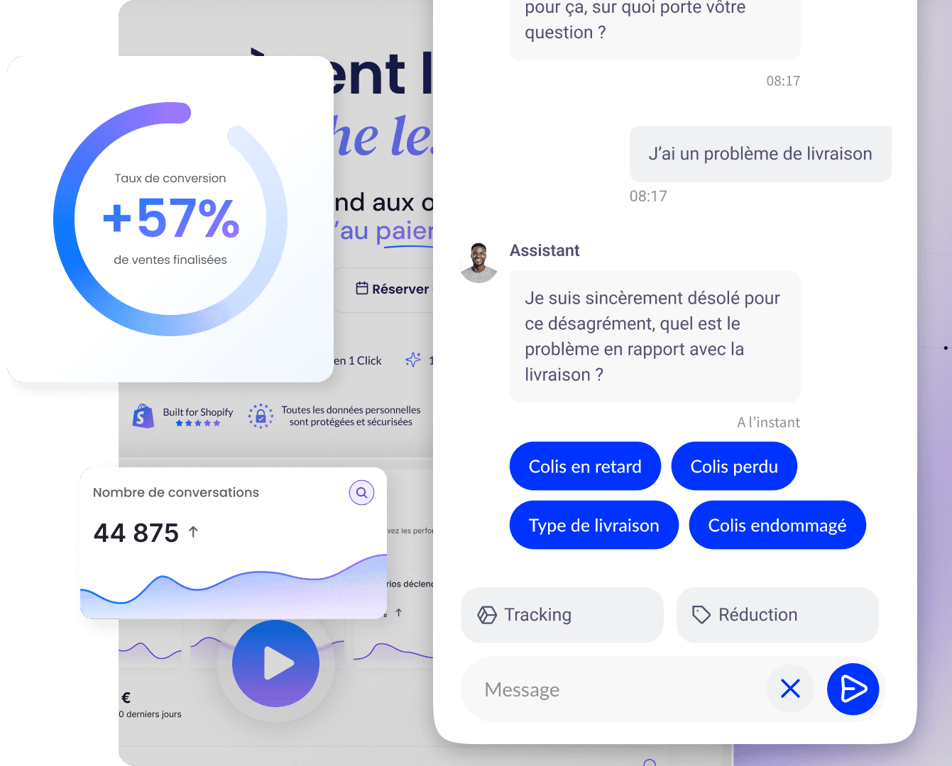


Empowering 200+ e-commerce merchants

Subscribe to the newsletter and get a personalized e-book!
No-code solution, no technical knowledge required. AI trained on your e-shop and non-intrusive.
*Unsubscribe at any time. We do not send spam.