Glossary
What is a CTA? E-commerce definition
June 4, 2026
A CTA (Call to Action) is the interface element that invites the visitor to take the next step: a button, link, or clickable banner. In e-commerce, the most critical CTAs lead to purchase ("Add to Cart", "Buy Now", "Proceed to Checkout"), but also to newsletter subscription or discovering a collection. A well-placed and well-phrased CTA supports conversion without weighing down the journey.
Summary
Definition: CTA, button, action link
The CTA translates a marketing intent into a concrete action. It most often materializes as:
Button: colored rectangle, action label ("Order", "Sign up").
Text link: "See the entire collection", "Learn more".
Banner or header: clickable promo in the header or pop-up.
Sticker or tag: on a hero image or social network.
Current hierarchy:
Primary CTA: main action of the page (often purchase).
Secondary CTA: complementary action with lower priority ("Continue shopping").
Micro CTA: small actions (filter, wishlist, share).
Useful distinctions:
CTA vs CTR: the CTA is the clickable element; the CTR measures the click-through rate on an ad or email.
CTA vs click to buy: click to buy describes a direct purchasing journey; the CTA is broader (newsletter, contact, purchase).
Transactional CTA vs Informational CTA: "Buy" vs "Read the size guide".
CTA vs CRO: CRO optimizes the entire user journey; the CTA is one of its testable levers.
CTA vs navigation: the category menu guides; the CTA drives a measurable action.
Why the CTA influences conversion
Without an explicit CTA, the visitor hesitates: they browse, compare, and then leave without a clear signal on the next step.
Orientation: guide towards purchase, registration, or support.
Conversion: a visible and credible button transforms intent into a measurable click.
Visual hierarchy: the primary CTA catches the eye (CSS, contrast, size).
Mobile: sufficient touch target, sticky button on product pages.
Campaigns: consistency between the ad ("-20%") and the landing CTA ("Get the offer").
Email and SMS: one main CTA per message prevents distraction.
Too many competing CTAs on the same page create the paradox of choice: the visitor no longer knows what to click. The practical rule: one main goal per screen, possibly supported by a discreet secondary action.
How to build a clear and compelling CTA
Strategic locations:
Home: hero "Discover the collection", seasonal promo.
Product page: "Add to cart", "Buy now" (dynamic Buy Button).
Collection: filters, sorting, clickable product cards.
Cart: "Checkout", promo code.
Checkout: "Pay", "Place order".
Pop-up: "Get 10% off", "No thanks".
Landing page ads: a single CTA above the fold.
Good phrasing (e-commerce French):
Action + benefit: "Add to cart", "Complete my order".
Honest urgency: "Take advantage of the offer" (if it's a real promo).
Avoid vagueness: "Click here" or "Submit" are not very meaningful.
Brand tone consistency: informal "tu" or formal "vous" aligned with the rest of the site.
For example: Shopify sportswear store. Home: primary CTA "View the new running collection" (collection link), secondary "Our bestsellers". Shoe page: black button "Add to cart" + text link "Size guide" under the selector. Cart: large "Checkout" button with shipping cost visible above. Black Friday promo email: a single "View deals" button leading to a dedicated landing page, not the home page. A/B testing on the product page label ("Add" vs "Add to cart") to measure clicks without changing the design.
CTAs in a Shopify theme
Shopify does not refer to a single "CTA" module: calls to action are configured via the theme, sections, and marketing channels.
Theme settings: button styles (color, corners, typo) applied globally (Shopify Help Center).
OS 2.0 Sections: Image banner, Featured collection, Rich text with "Button label" field + URL.
Dynamic checkout buttons: "Buy it now" CTA (Shop Pay, Apple Pay) on product pages.
Shopify Email: button blocks with product or collection links.
Pop-up Apps: Privy, Klaviyo forms, etc. (email capture CTA).
Checkout: checkout button labels based on shop language.
Merchant Checklist:
First, verify that each hero section has an active button link (no dead CTAs).
Next, test CTAs on mobile (size, sticky add-to-cart if supported by the theme).
Then, align landing ad UTMs with the CTA destination page.
Next, track CTA clicks in GA4 (events or funnel exploration).
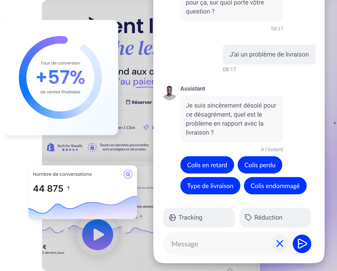
A well-placed chat or FAQ can guide users to the right CTA (such as a size guide before buying shoes), complementing the visible buttons on the product page.
The key takeaways about the CTA
CTA = element that drives action (button, link, banner).
Primary vs secondary: clear hierarchy per page.
Key challenges: orientation, conversion, campaign consistency.
Shopify: theme, sections, dynamic checkout, email, apps.
Explicit phrasing, mobile placement, testing, and one goal per screen.
Related terms, FAQ, and useful resources
Associated Terms
CRO: optimizing CTA and user journeys.
Click to buy: direct purchase journey via CTA.
CTR: measurement of upstream clicks.
Conversion funnel: steps where CTAs should be placed.
CSS: visual styling of buttons.
FAQ
CTA and button: the same thing?
In e-commerce, the two are often confused. The CTA is the call-to-action concept; the button is its most common form. A text link or a clickable banner can also serve as a CTA.
Which CTA on a Shopify product page?
The standard is "Add to cart". Many stores also add "Buy it now" (dynamic checkout) for customers in a hurry. A "Size Guide" or FAQ link can reduce hesitation before the purchase click.
How many CTAs per page?
Aim for one primary CTA per visible area (hero, product page, cart). Secondary actions (continue shopping, share) are possible if they remain visually subordinate.
How to test a CTA?
A/B tests on wording, color, or placement via a CRO app or Google Optimize alternative. Measure clicks, cart addition rate, and final conversion in analytics, not just the isolated click.
Going further
Optimizing a product page for conversion.
Improving the conversion rate.
Mobile-first e-commerce design.
Back to the Qstomy e-commerce glossary.
Sources: Shopify Help Center (Theme settings), e-commerce UX tips.
Enzo
13 May 2026

Convert over 2,000 customers on average per month with Qstomy.
The world’s 1st Shopify AI dedicated to customer conversion


Empowering 200+ e-commerce merchants

Subscribe to the newsletter and get a personalized e-book!
No-code solution, no technical knowledge required. AI trained on your e-shop and non-intrusive.
*Unsubscribe at any time. We do not send spam.